Cathédrale
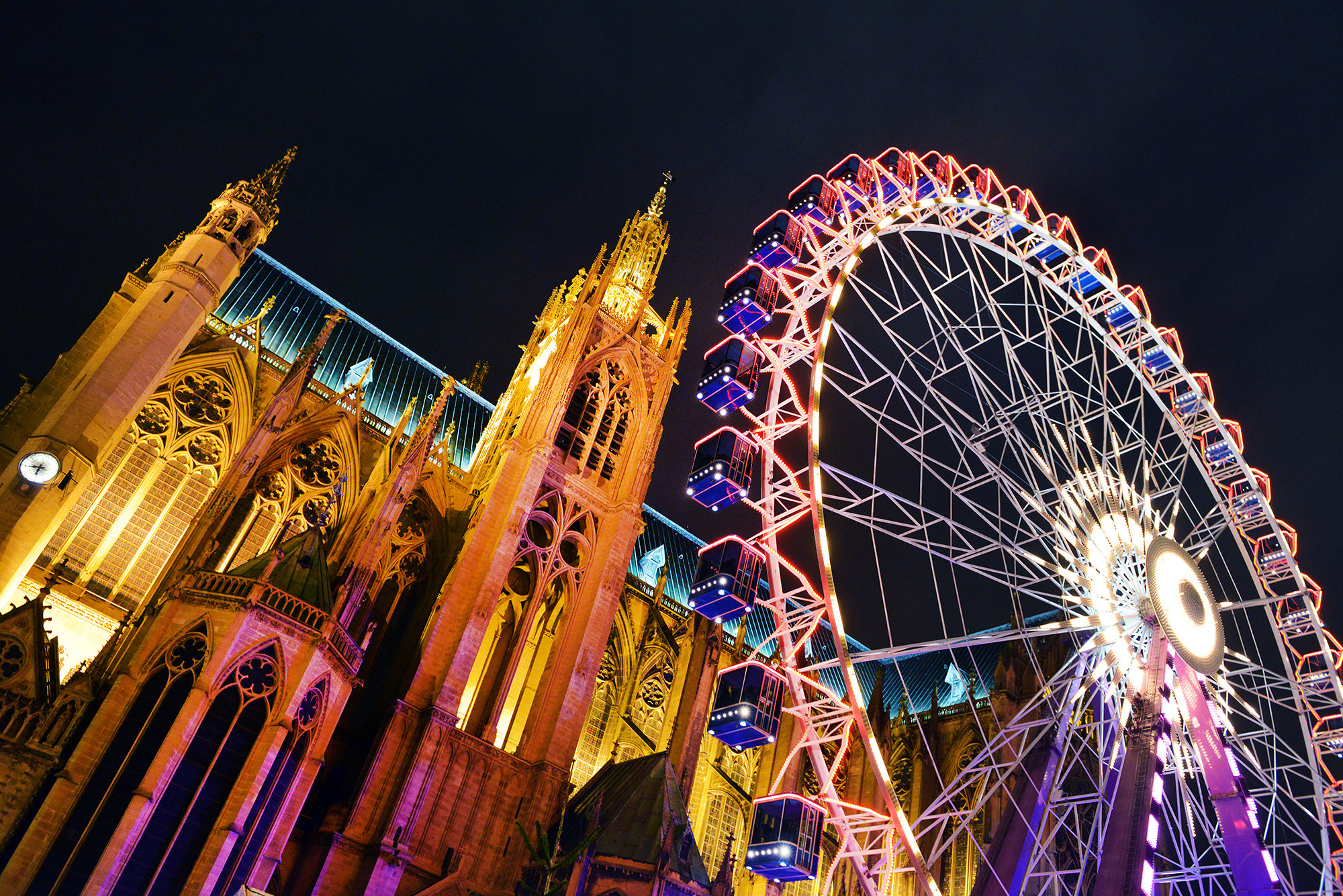
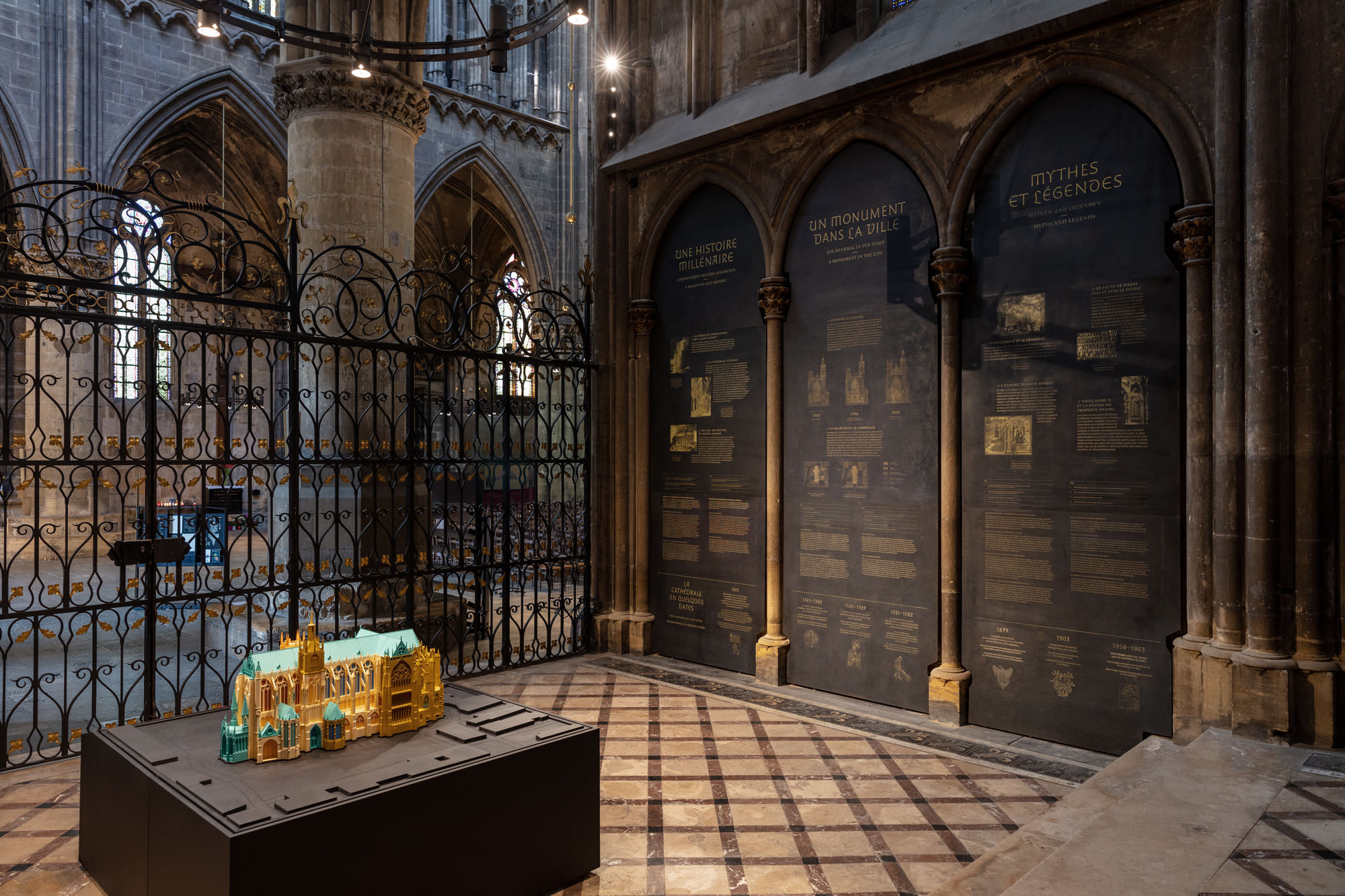
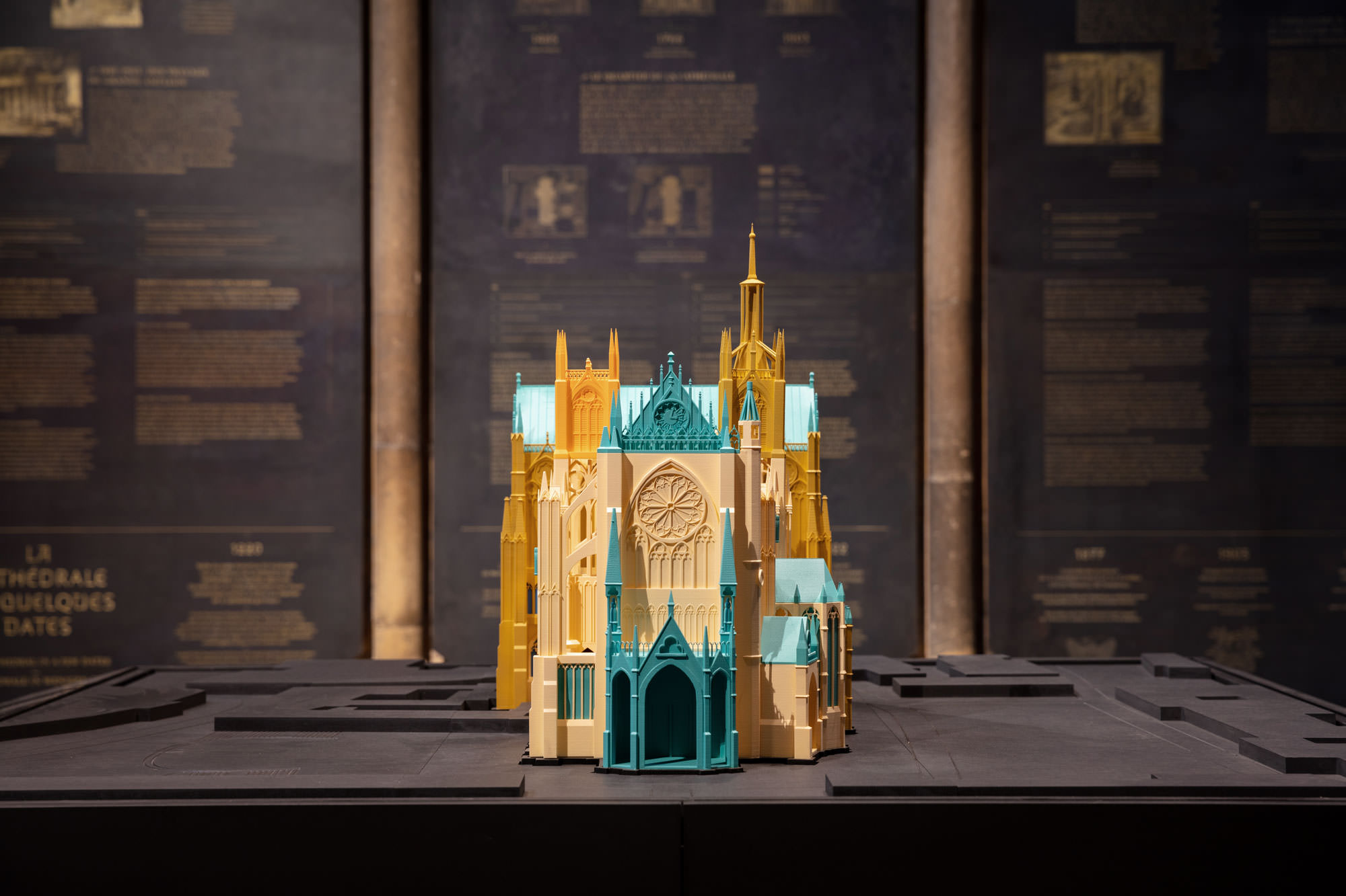
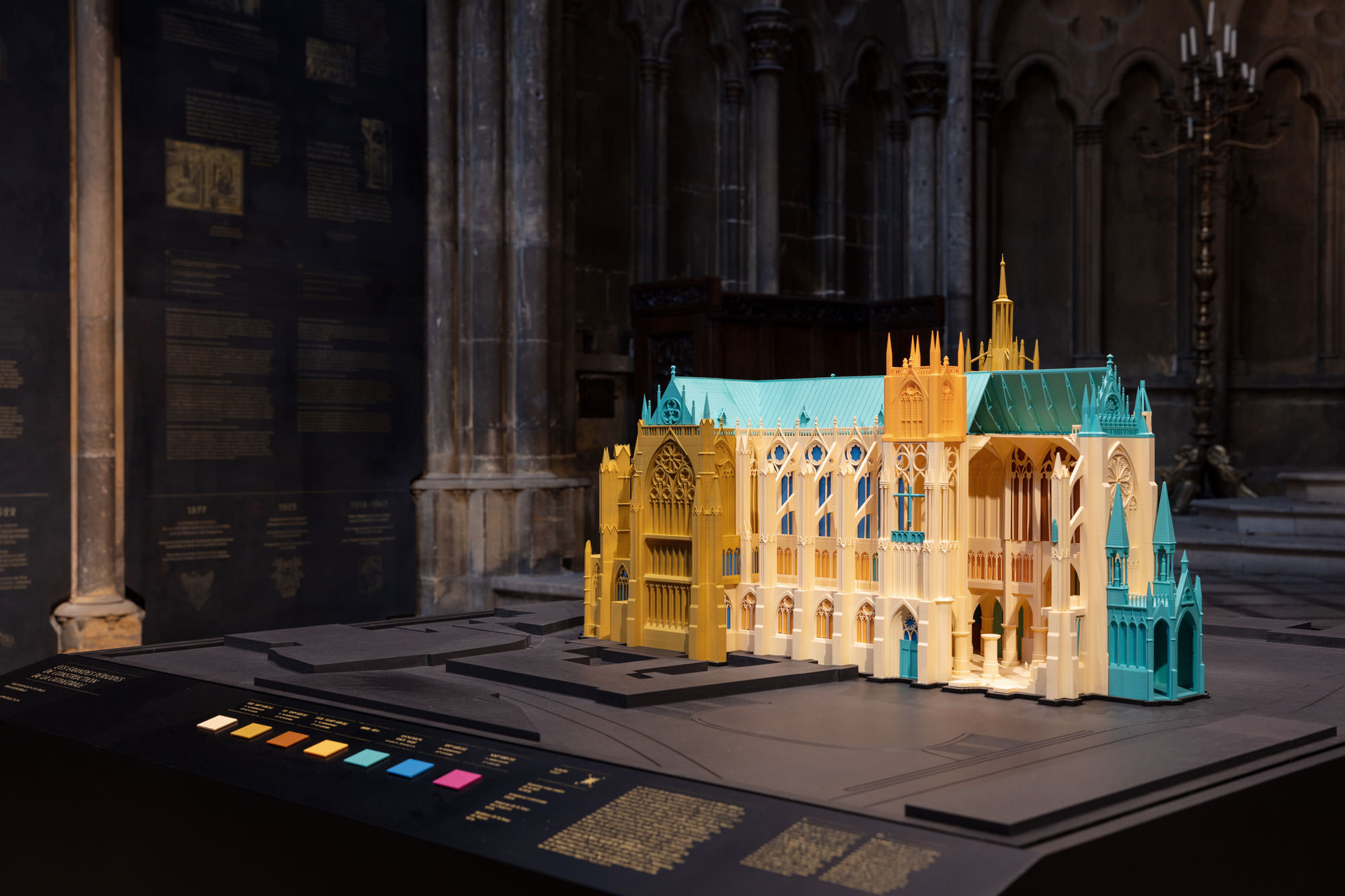
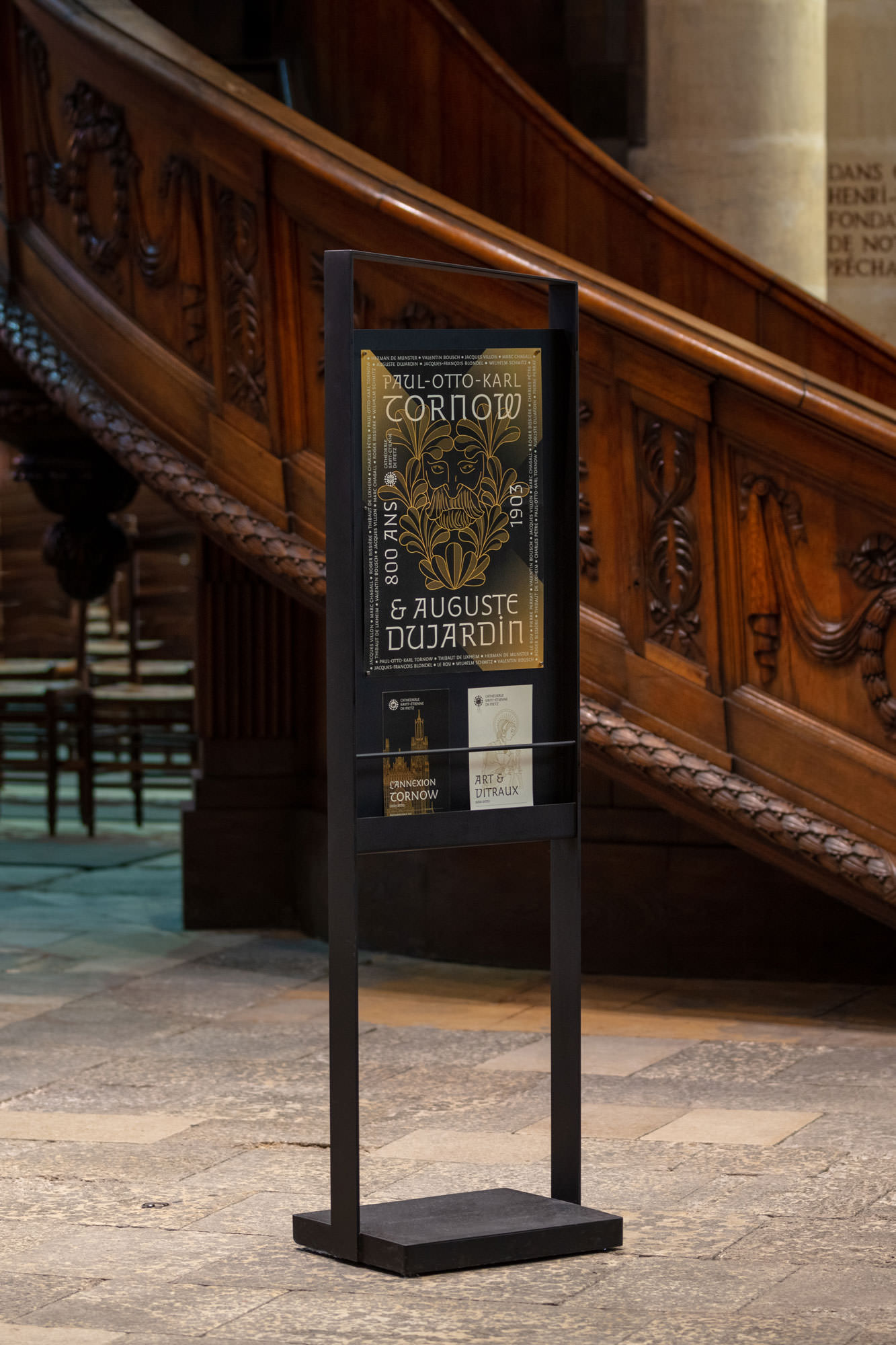
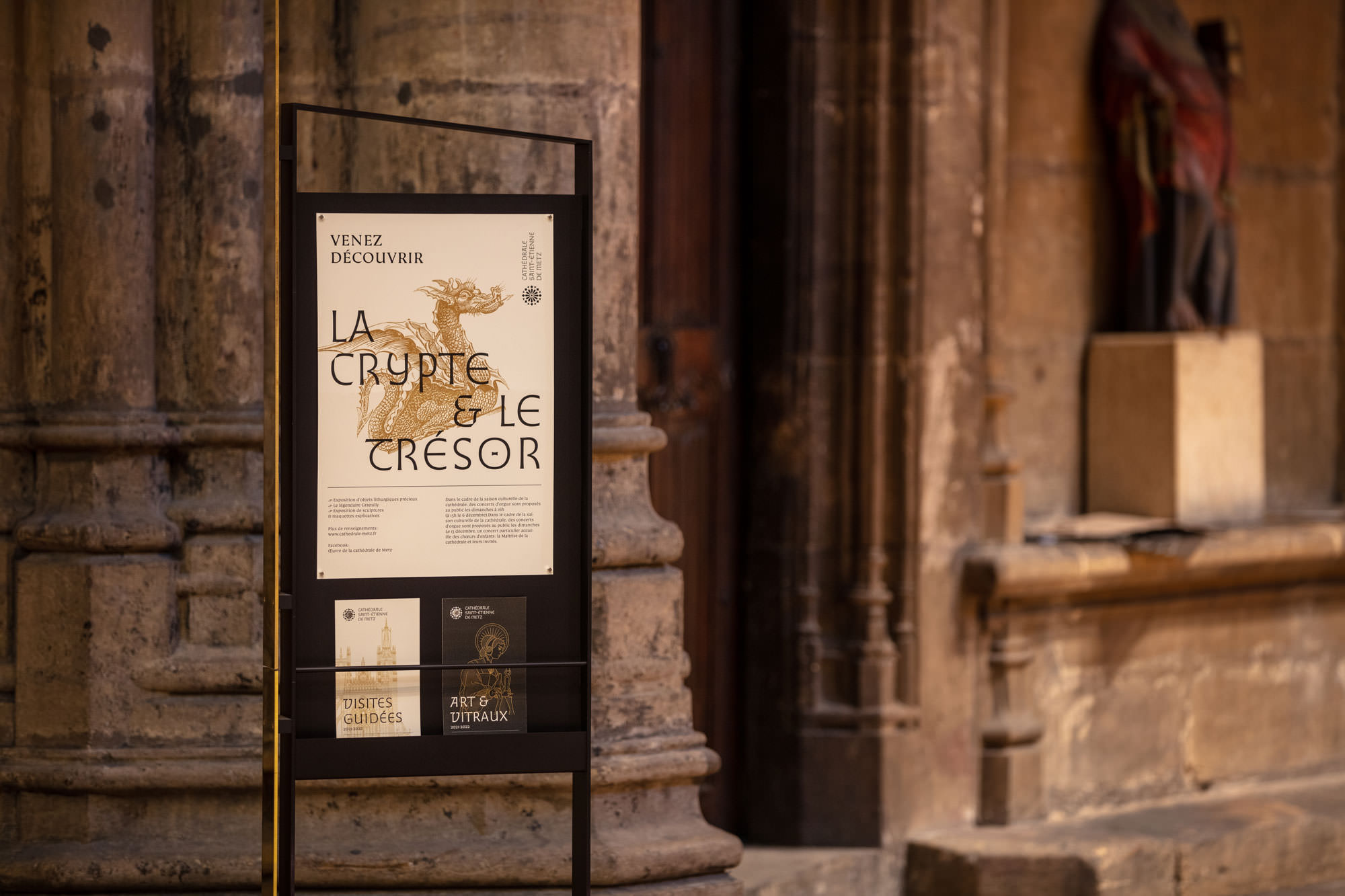
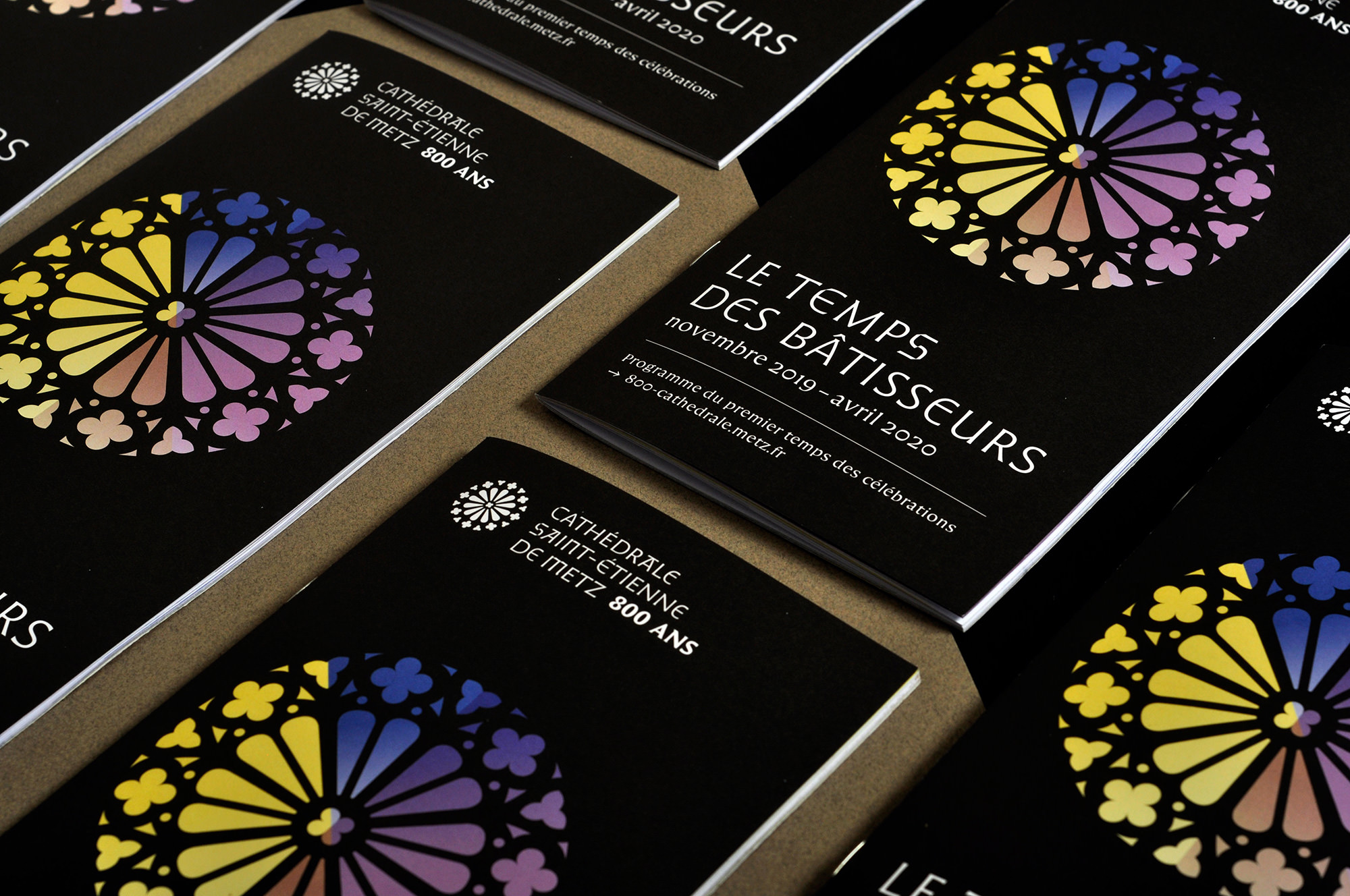
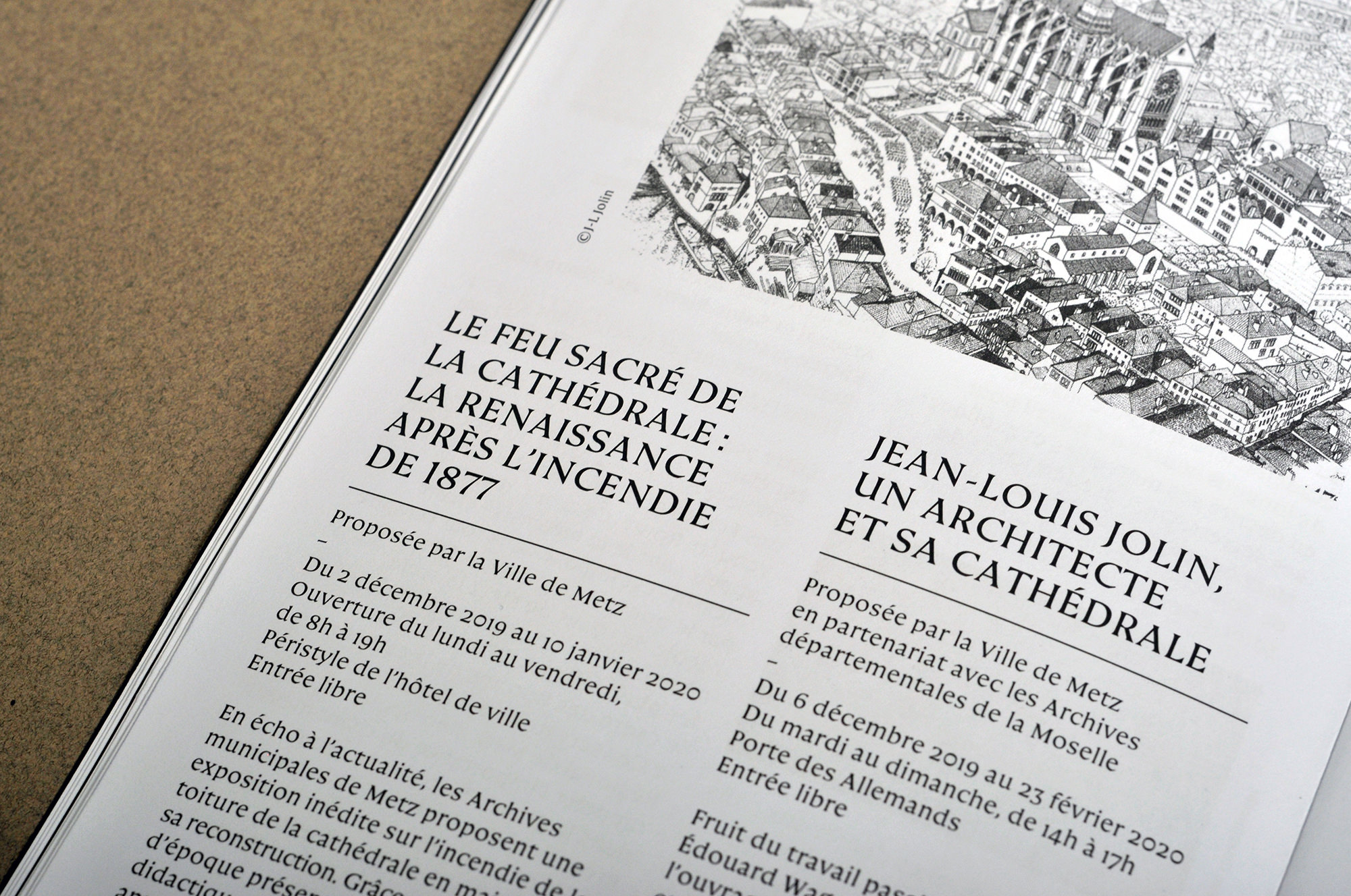
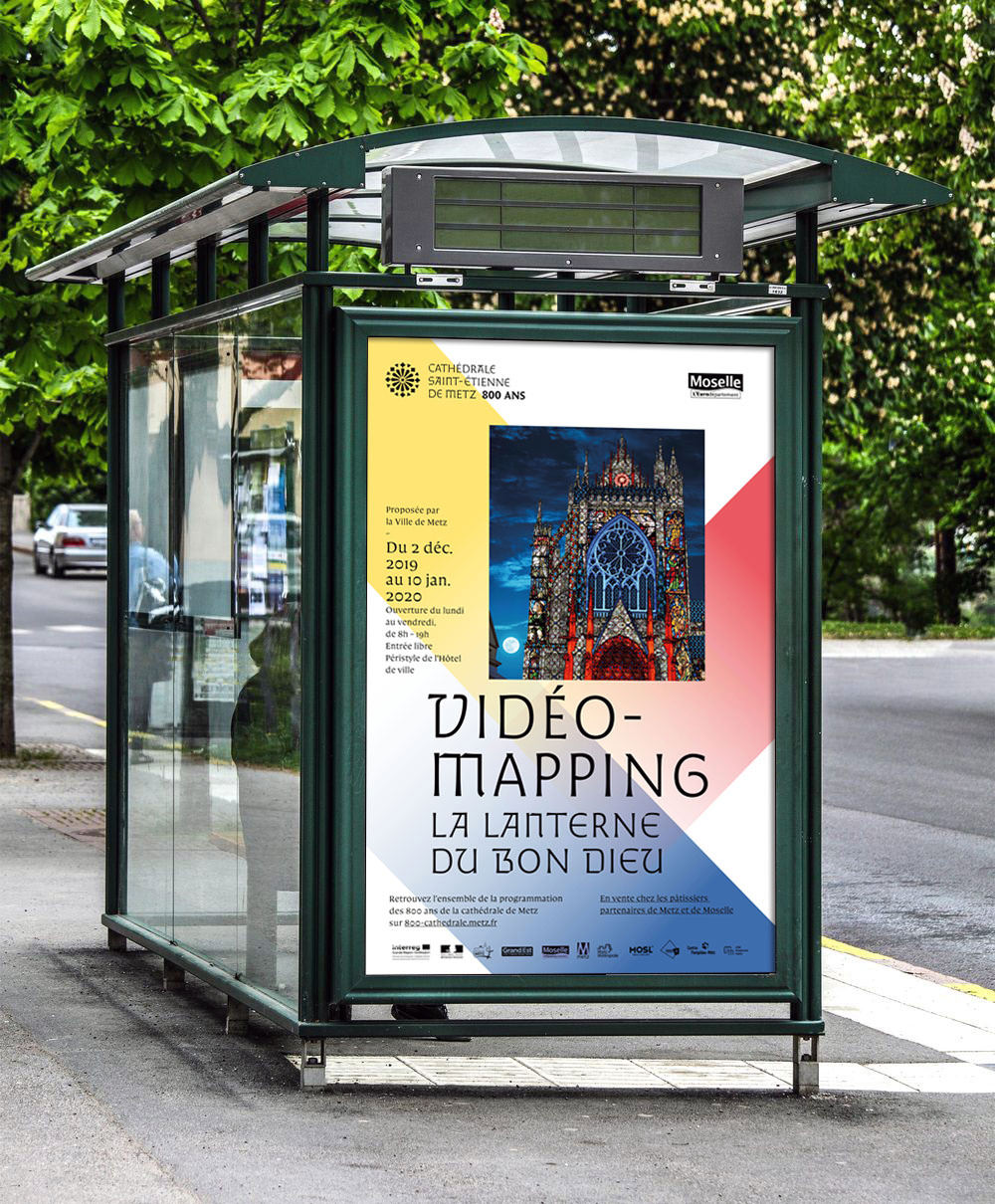
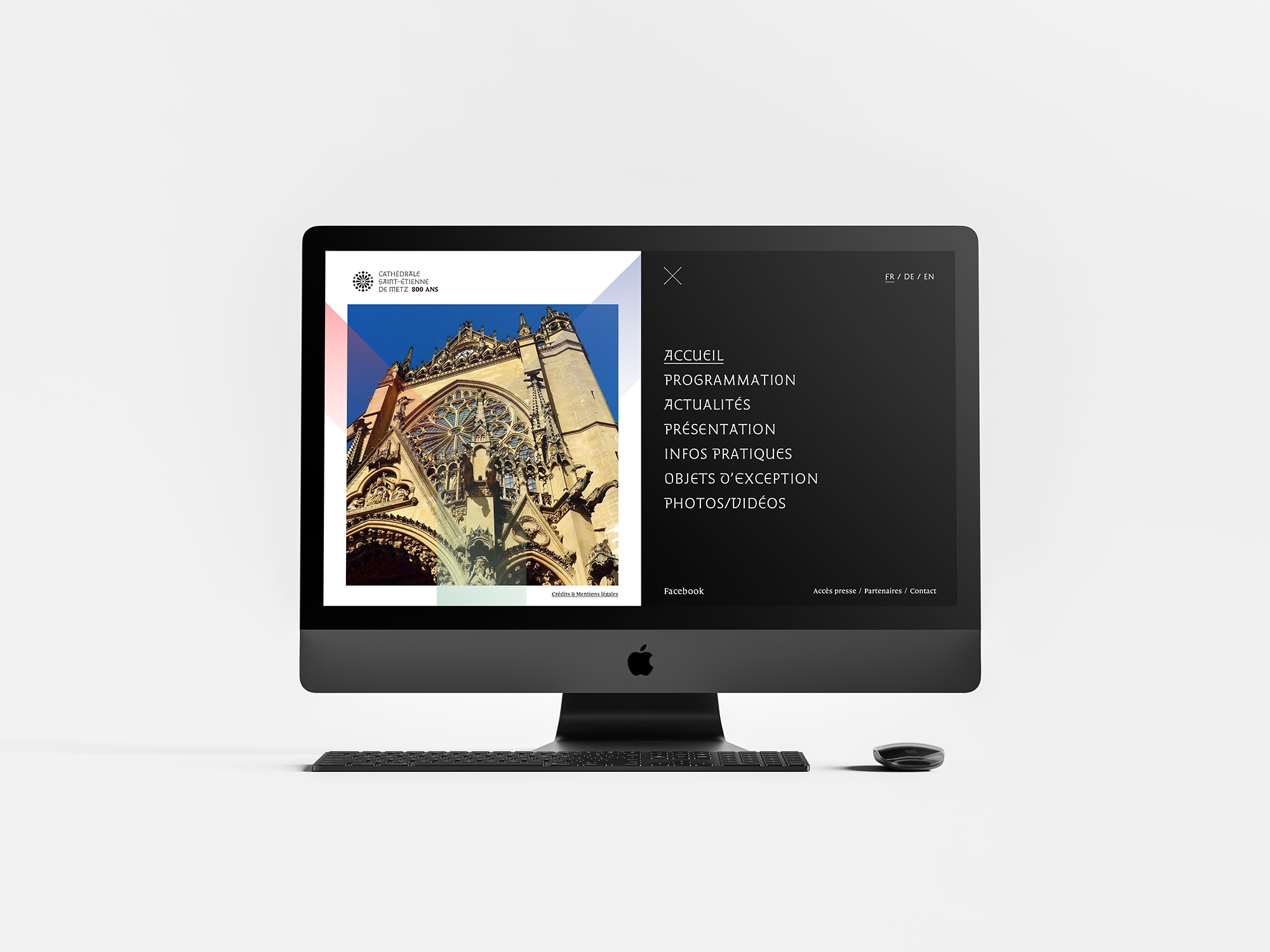
Together with Nouvelle étiquette, a French graphic design studio, we designed a series of custom typefaces for the visual identity and signage system of the Saint-Étienne of Metz cathedral, a magical Gothic cathedral in France that turned 800 years old in 2020.
The celebration of the 800th anniversary of this unique Gothic cathedral, which has the largest stained glass window area among European cathedrals (and which includes the famous vitraux by Marc Chagall), led to a public competition in France that was finally awarded to Nouvelle étiquette. In turn Nouvelle étiquette had invited PampaType to join the project to design the custom fonts to be used in the information and signage systems, as well as for the visual identity of the cathedral.
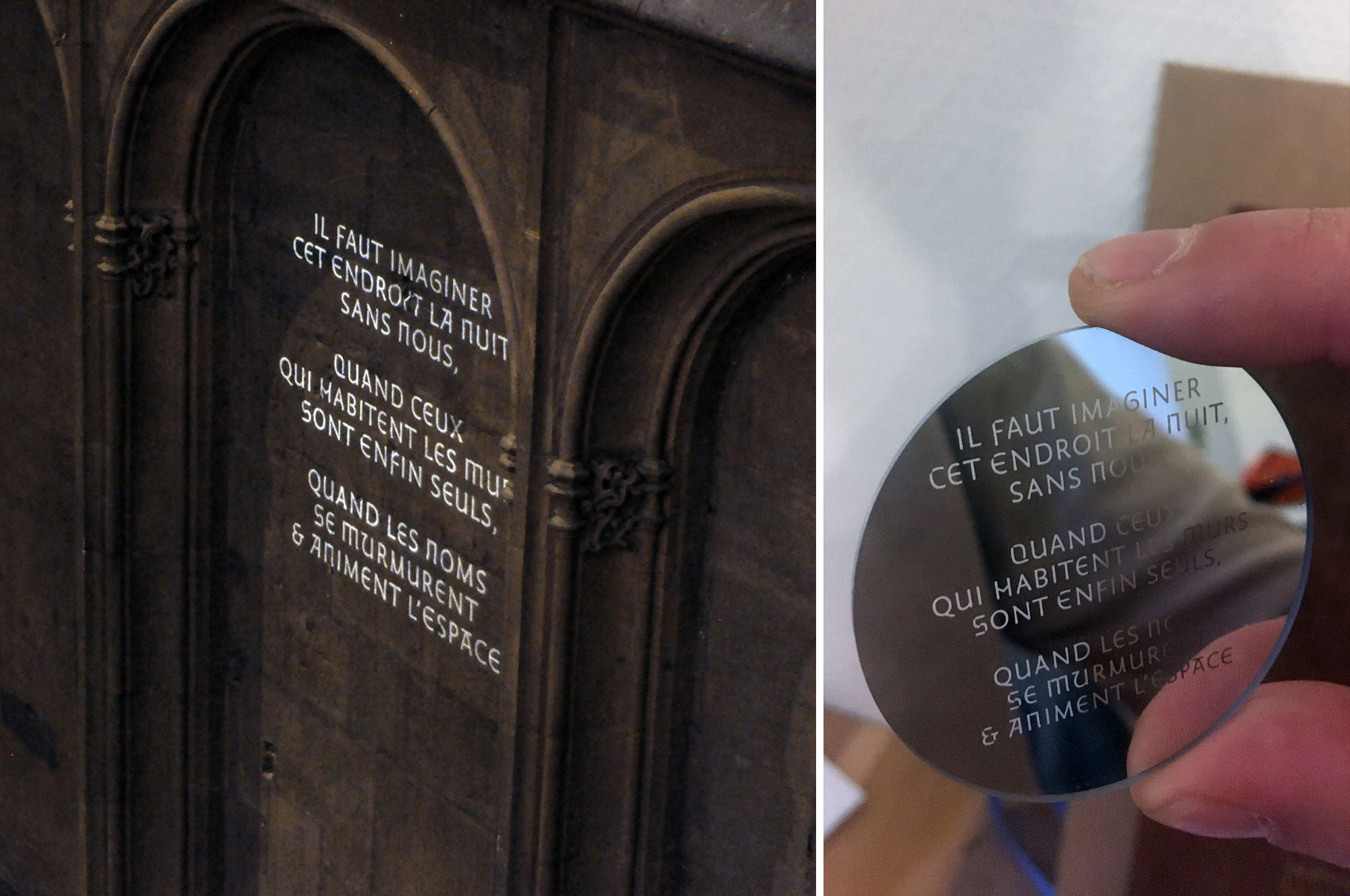
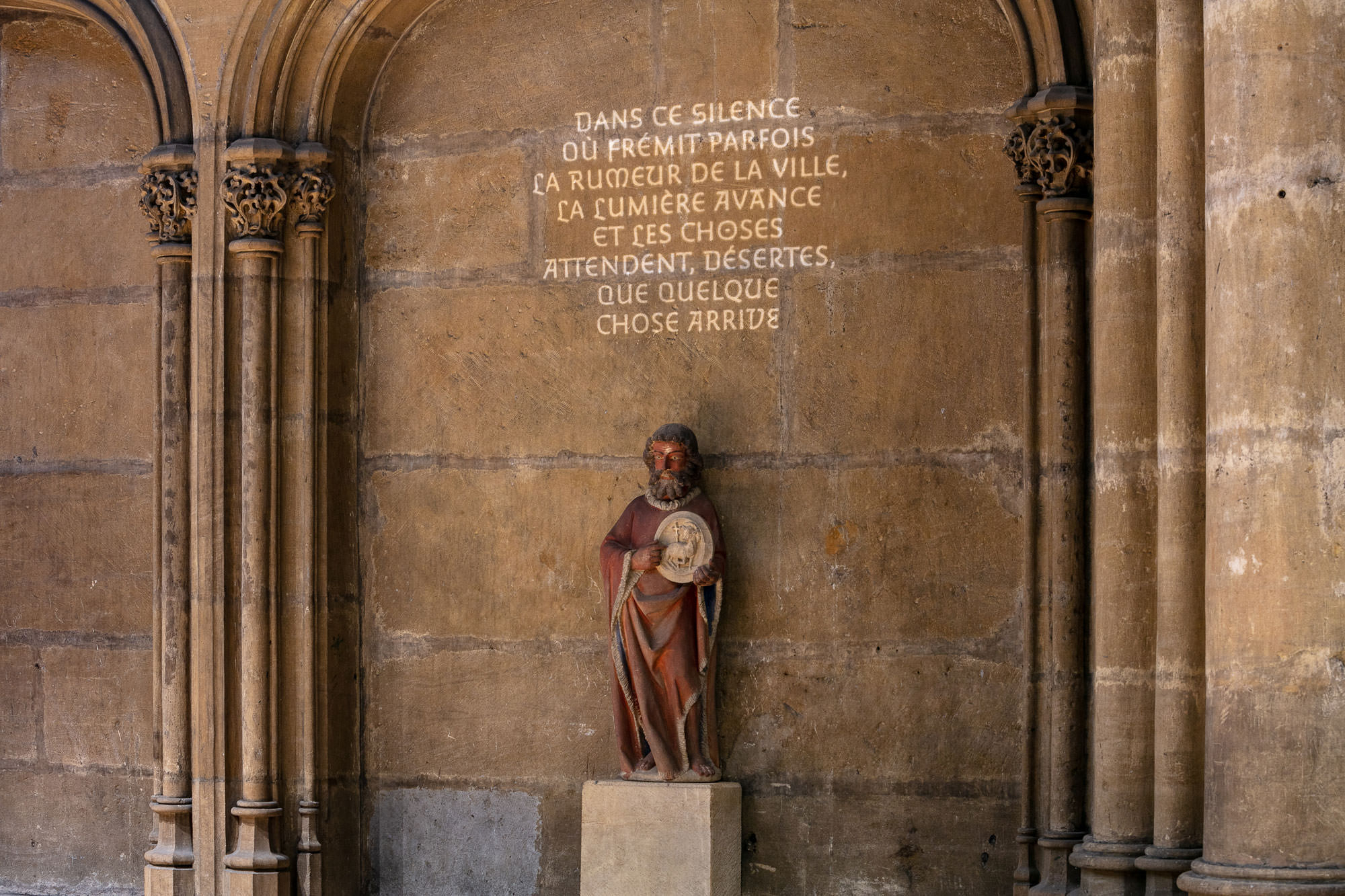
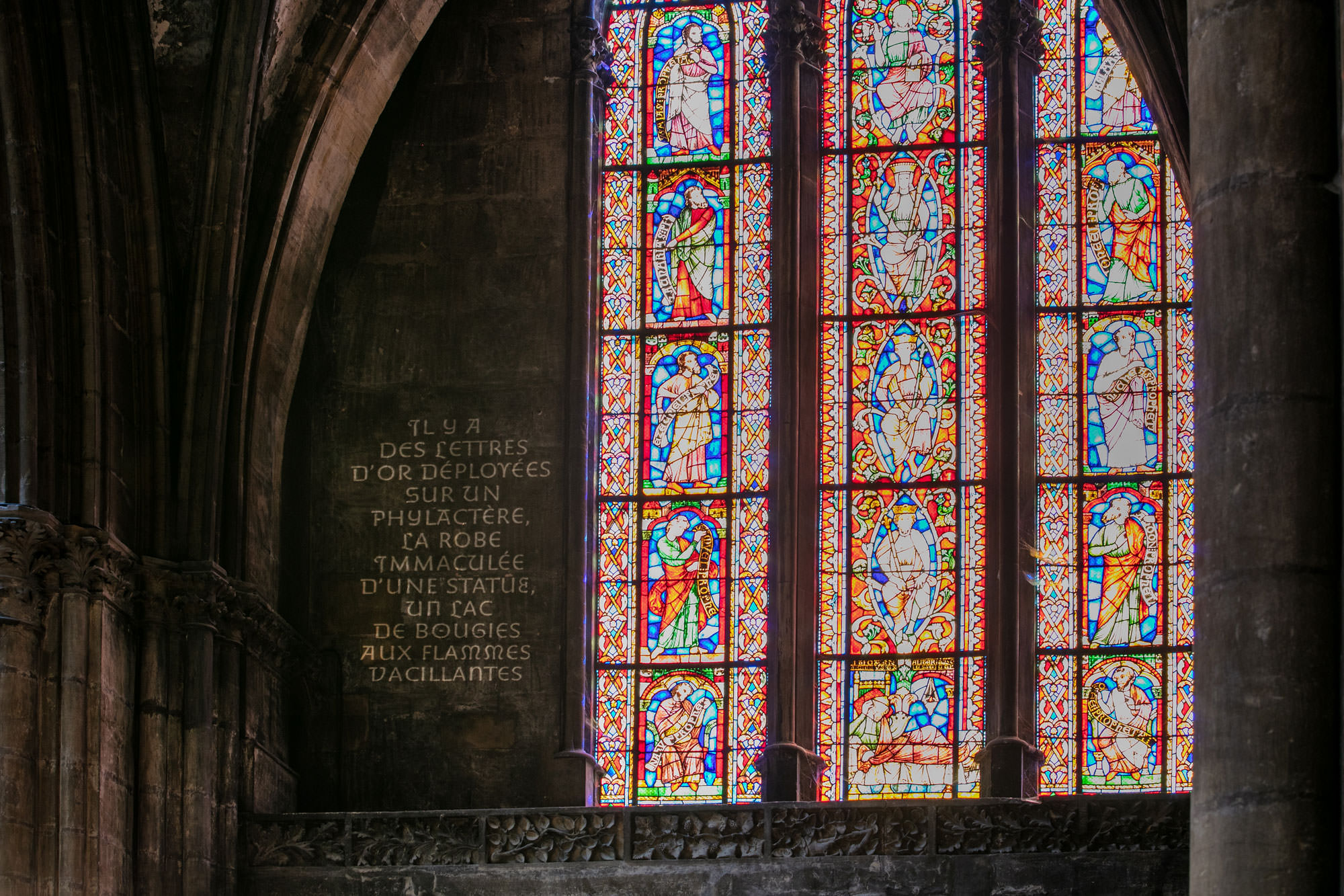
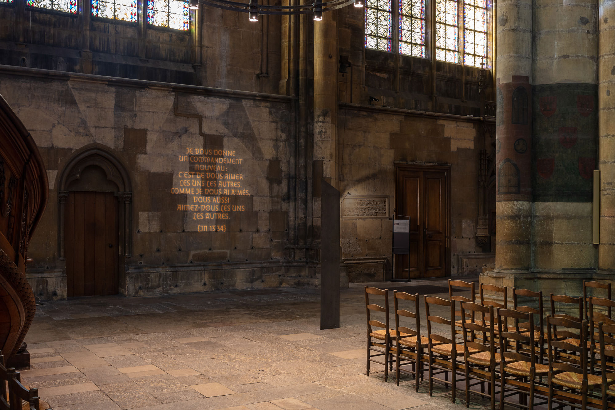
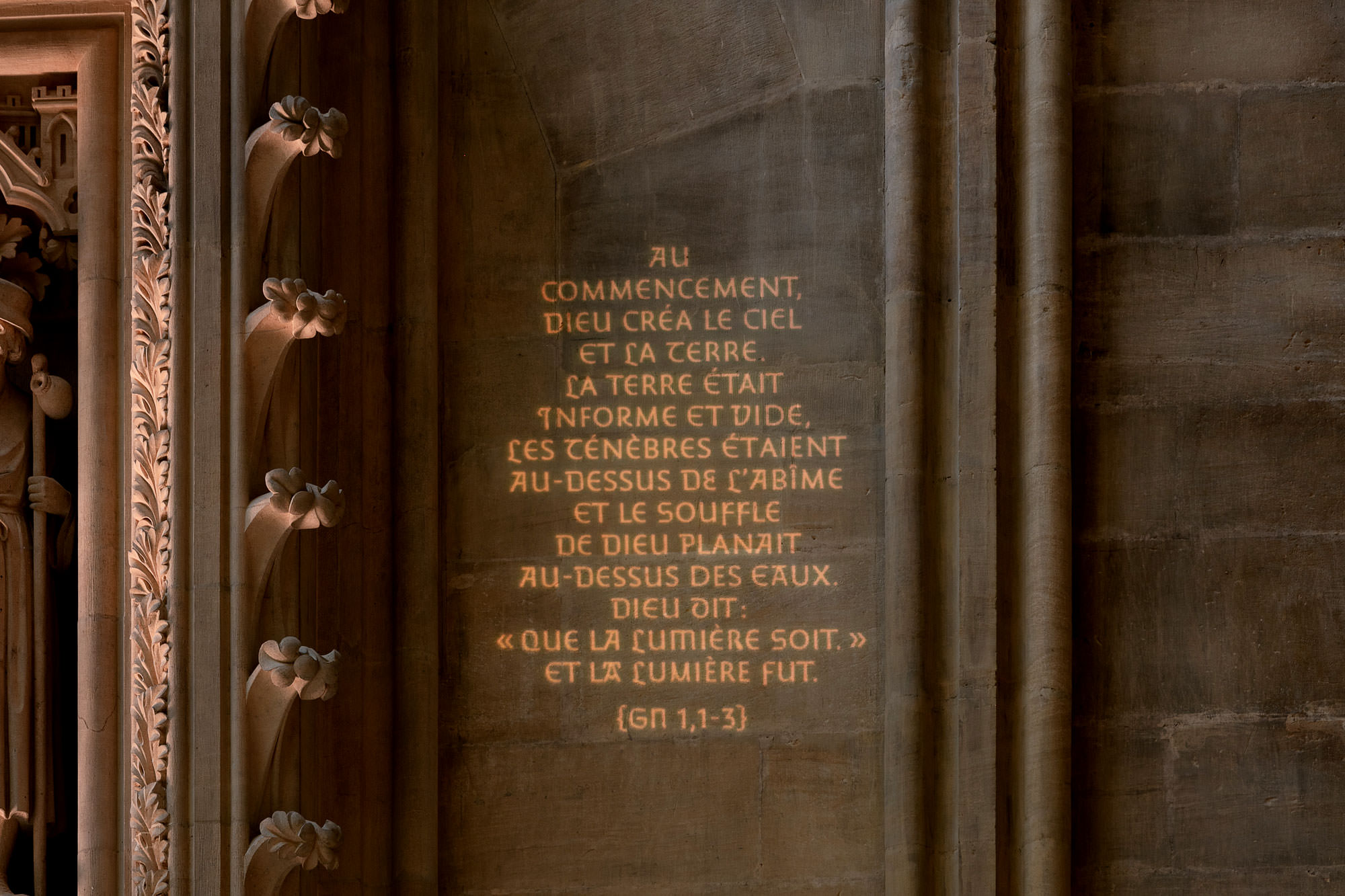
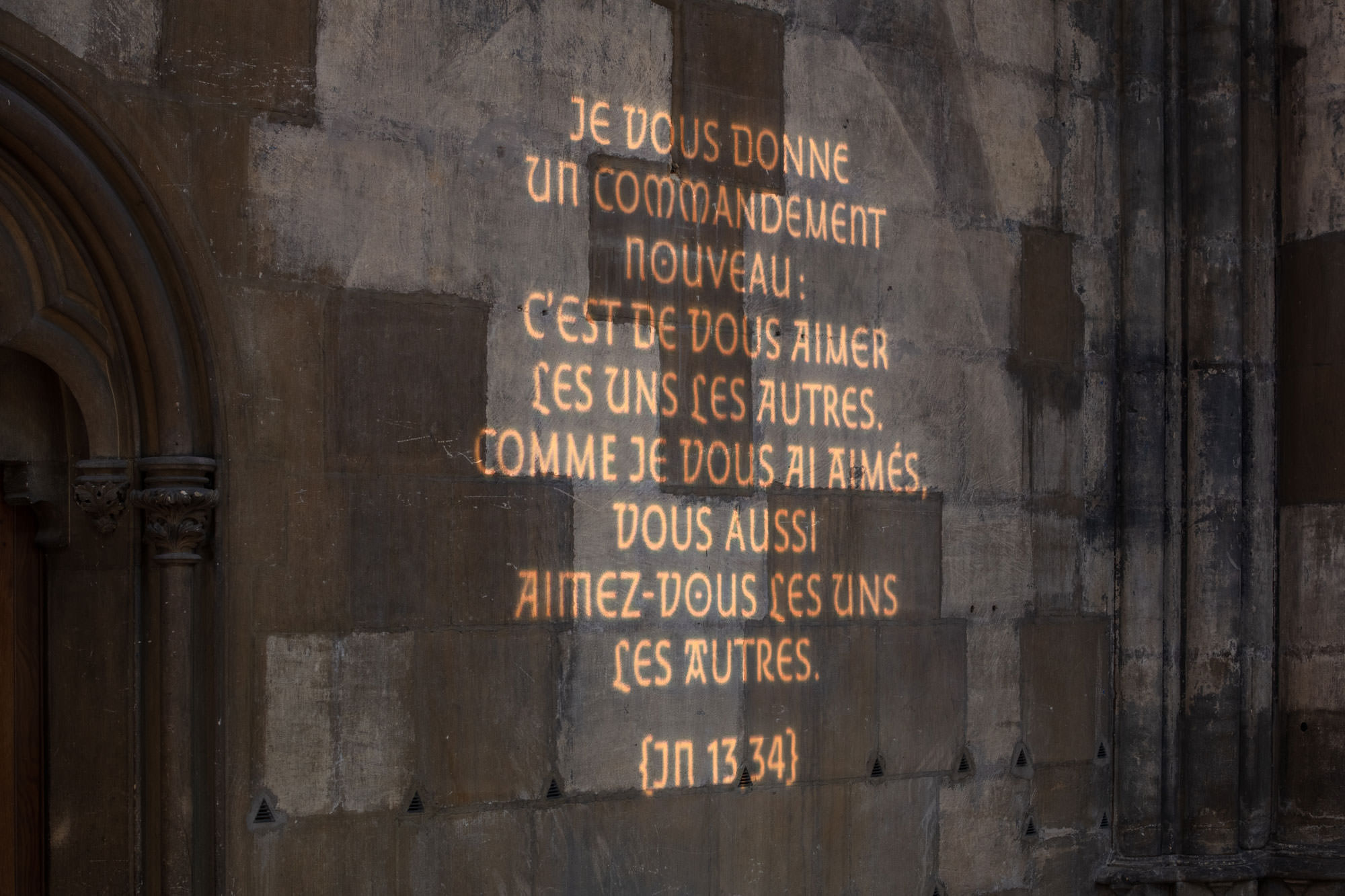
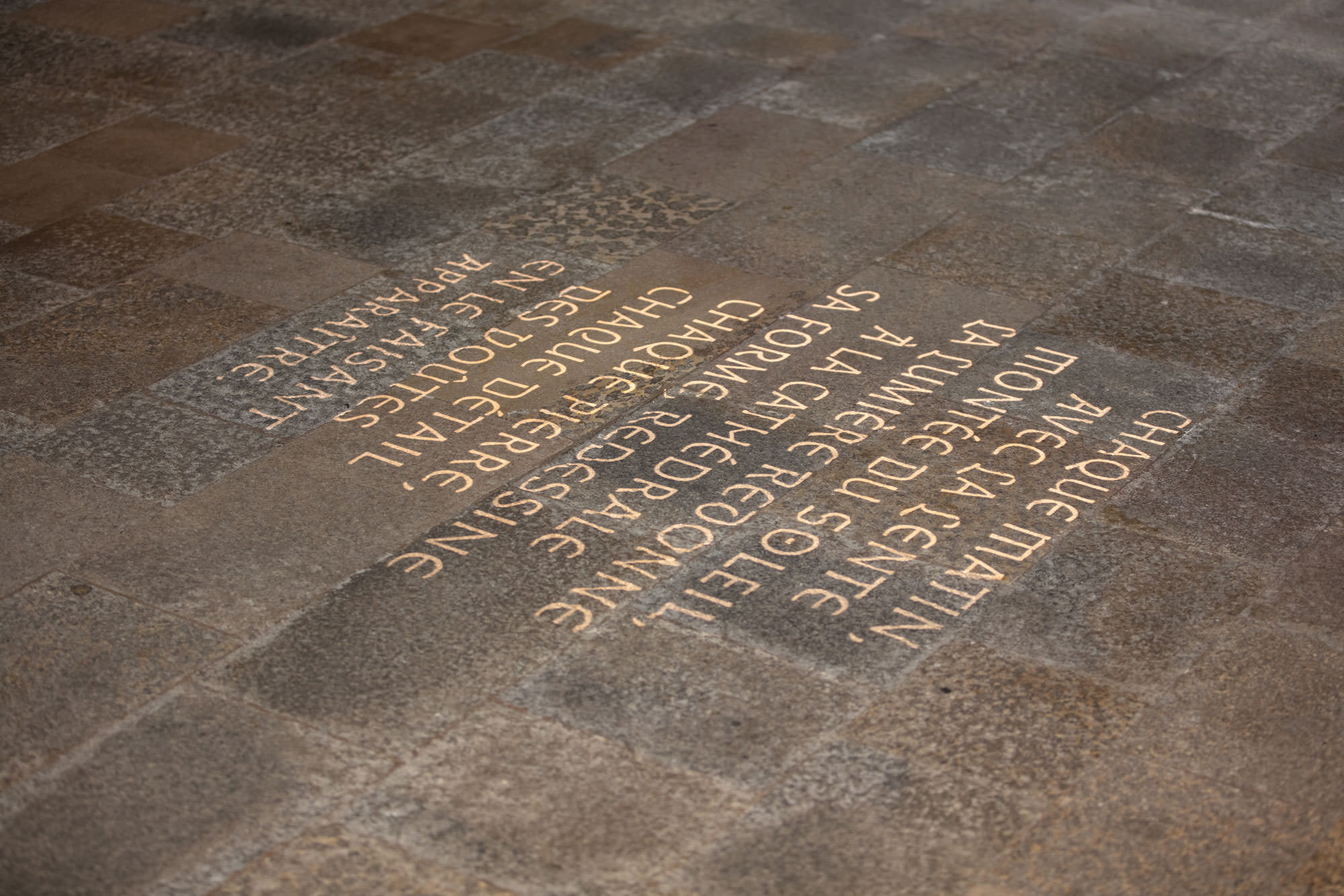
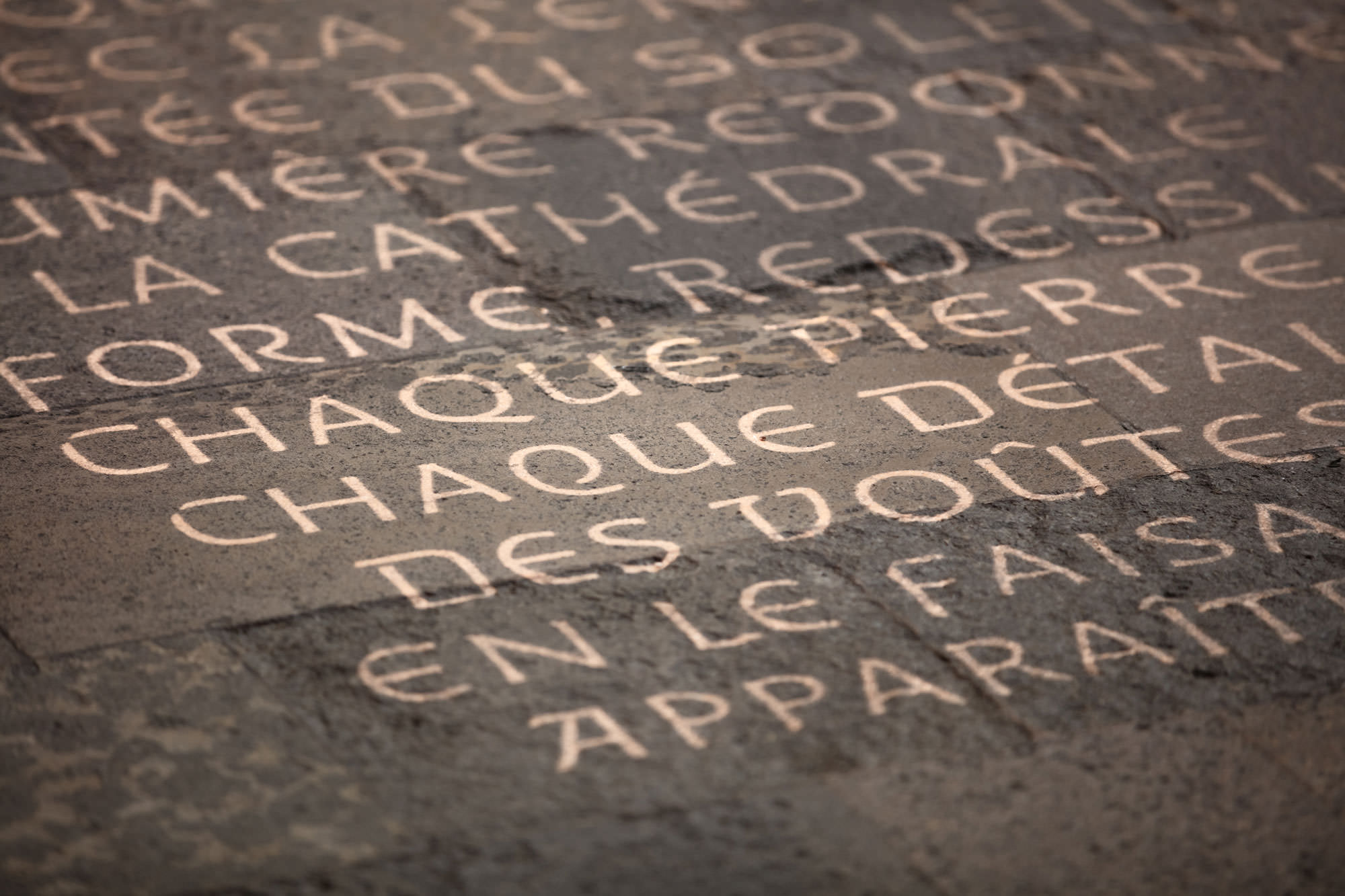
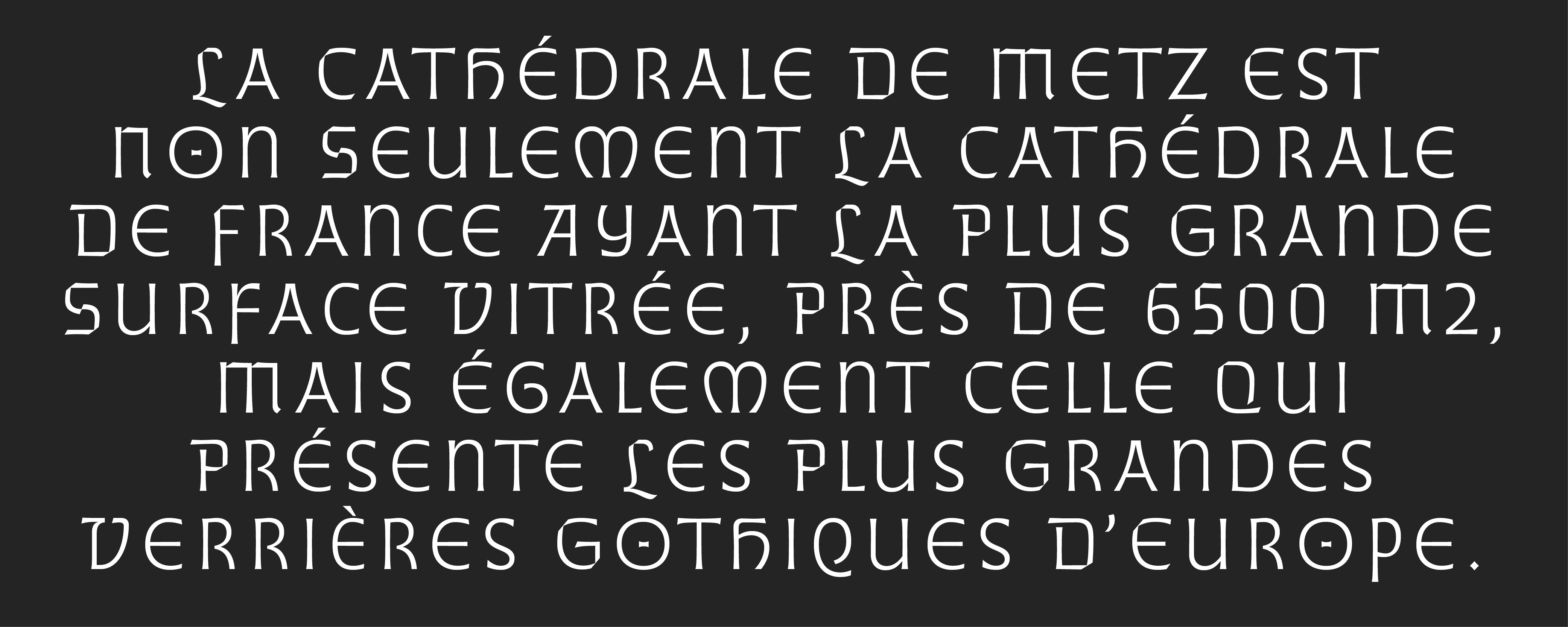
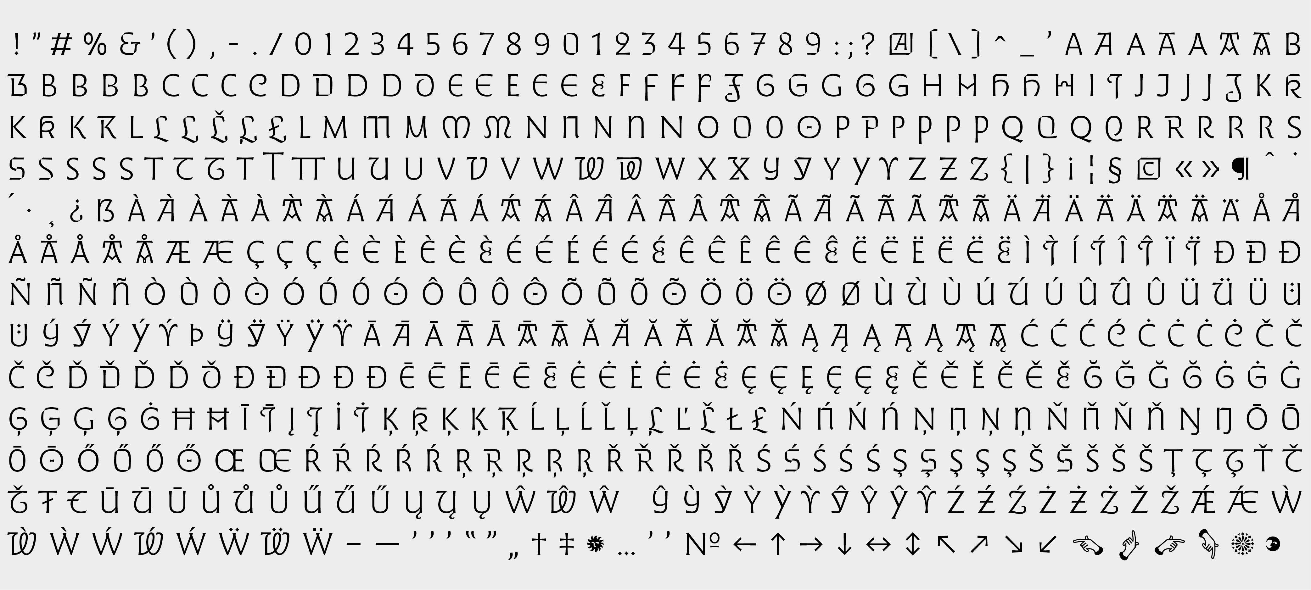
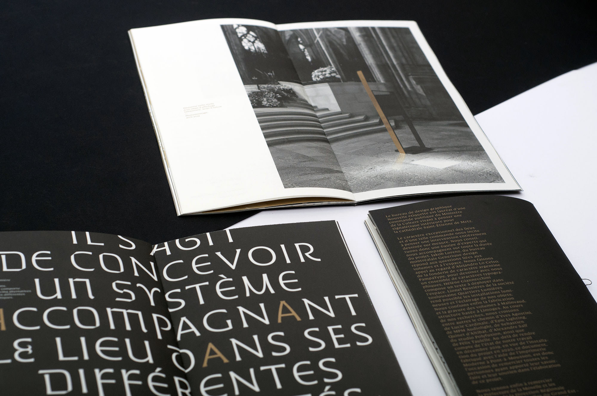
Thus, the first font we designed is Cathédrale Lumière, a titling, all-caps font conceived to be used in phrases of the spiritual path within the building, phrases that are light-projected on the walls of the cathedral using a series of gobo projectors specially installed on site. In terms of style, the Lumière font is an attempt to integrate the incredible richness of medieval scriptural traditions.
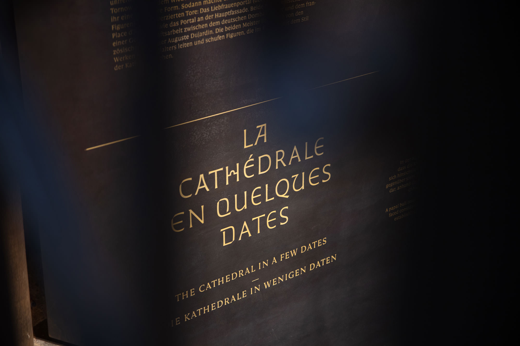
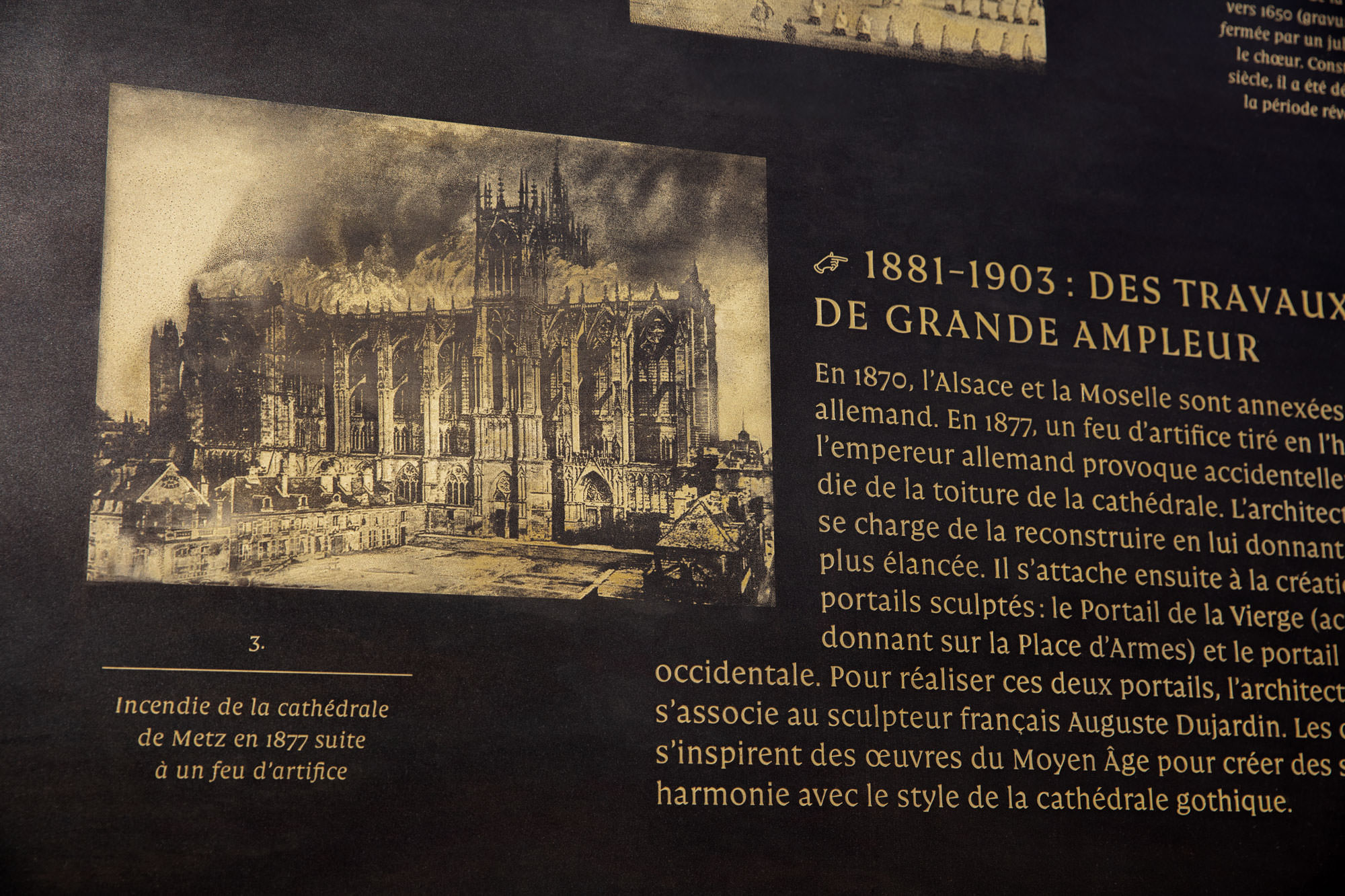
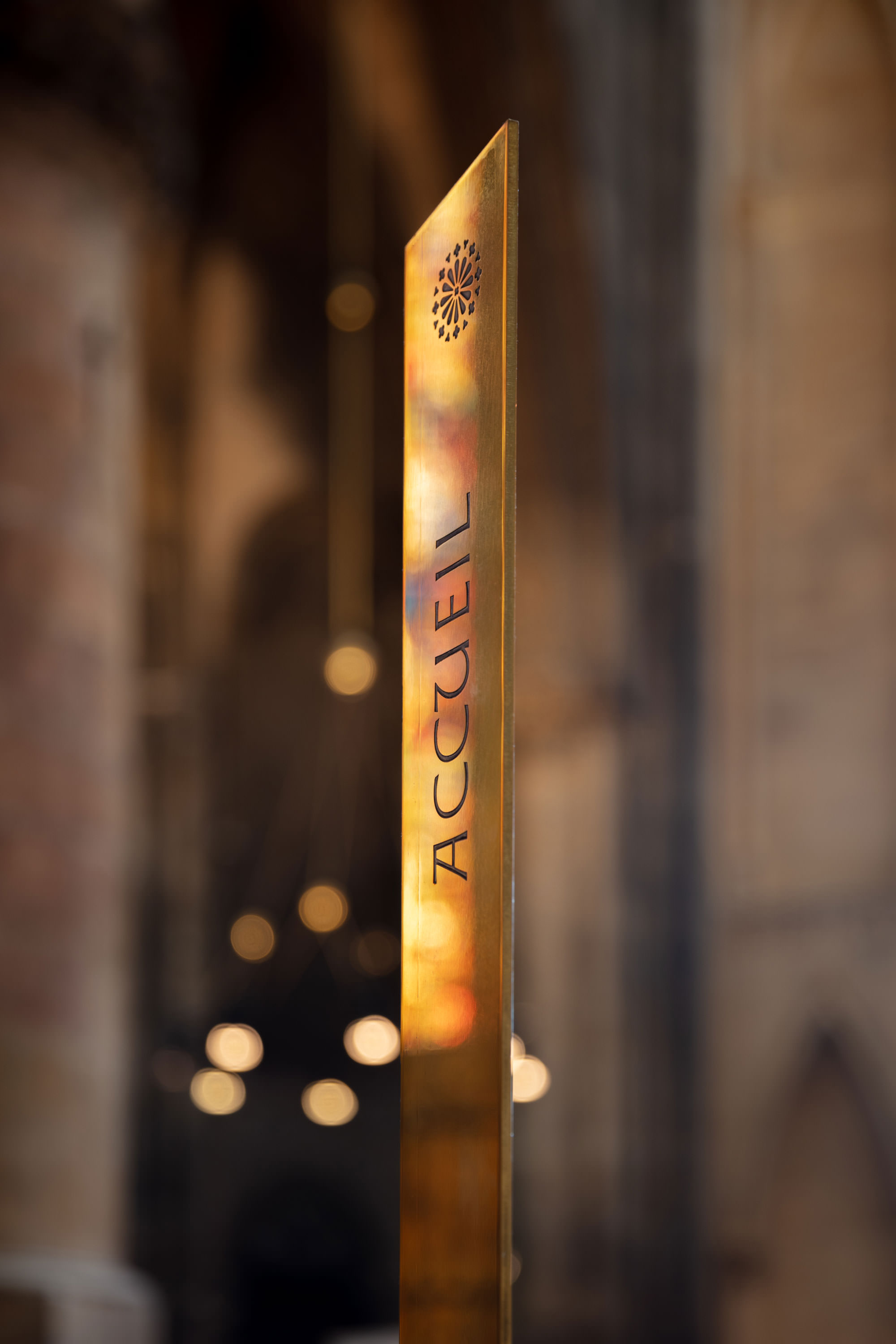
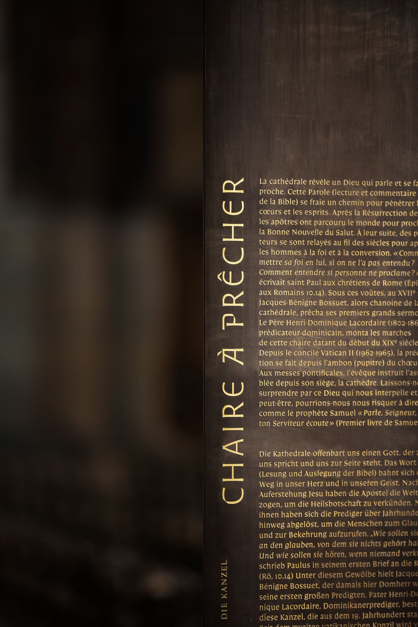
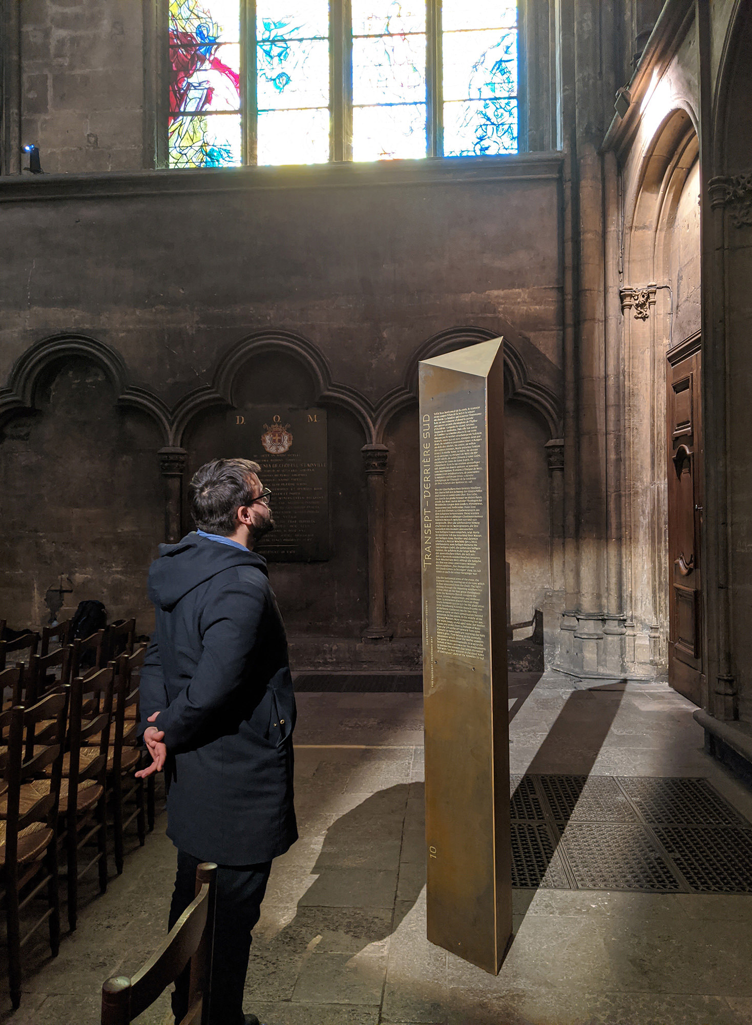
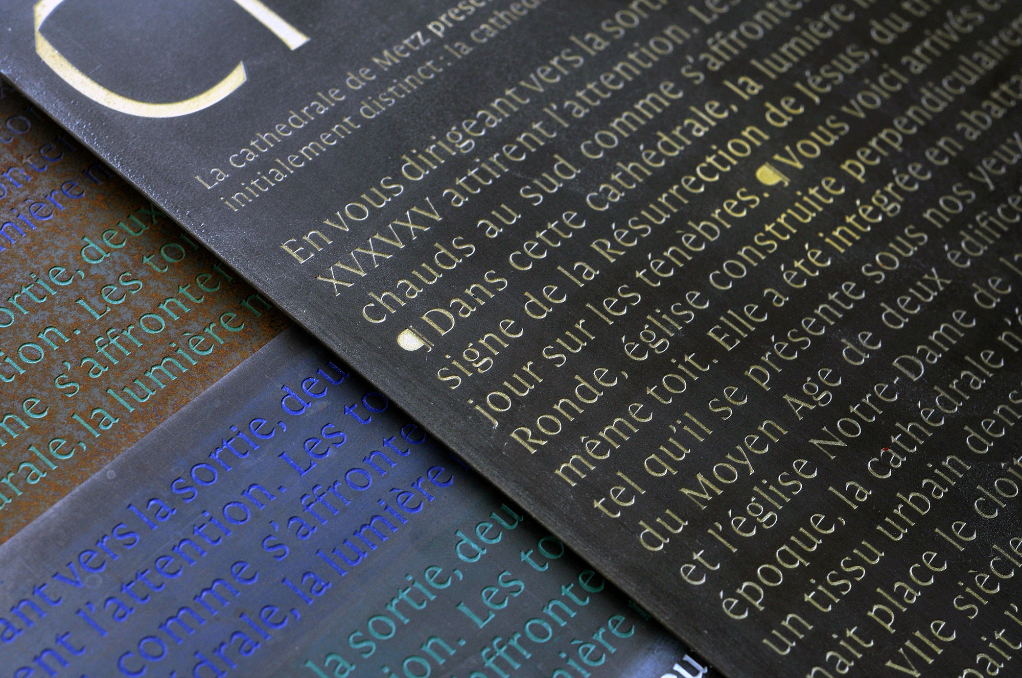
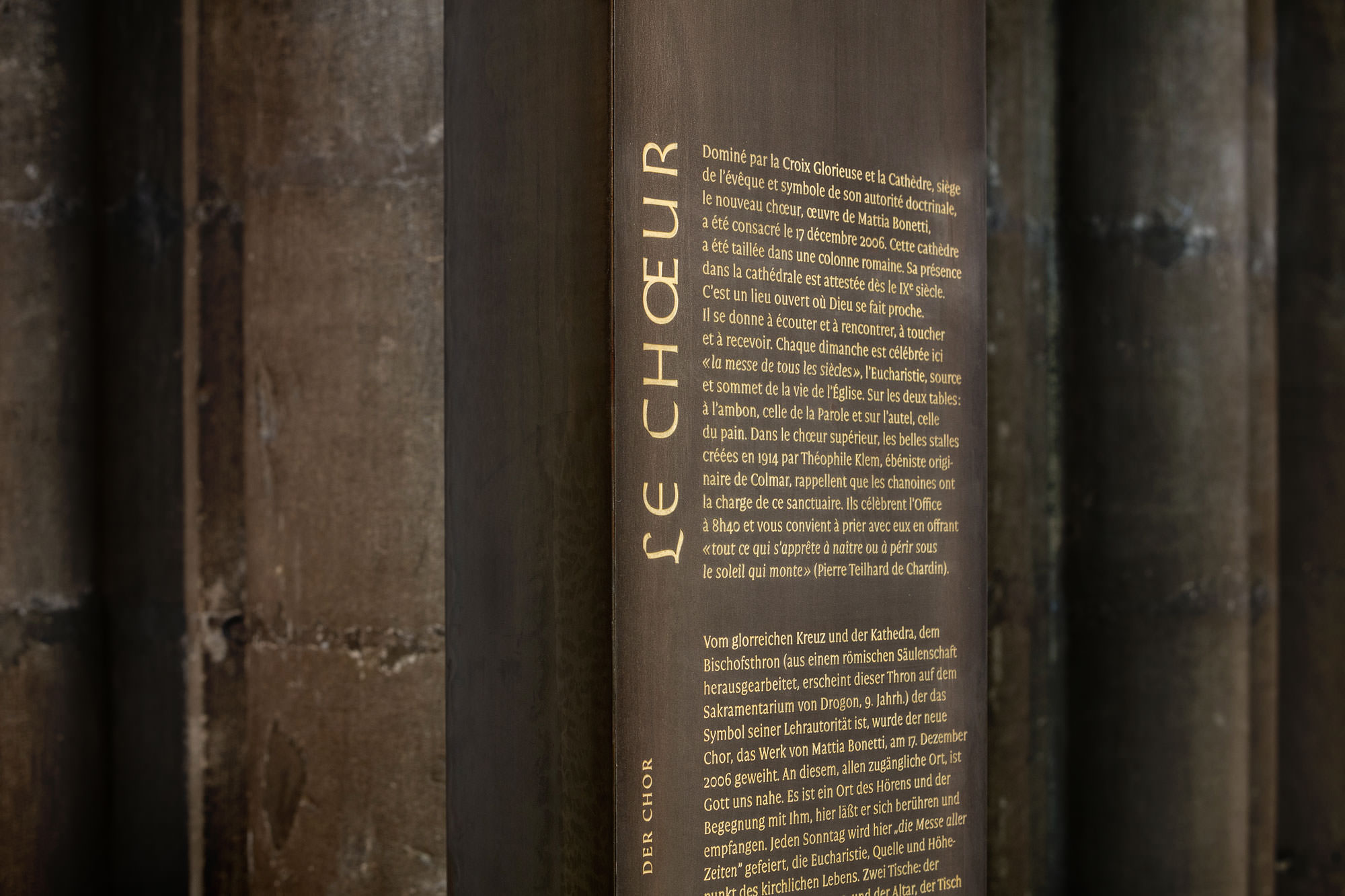
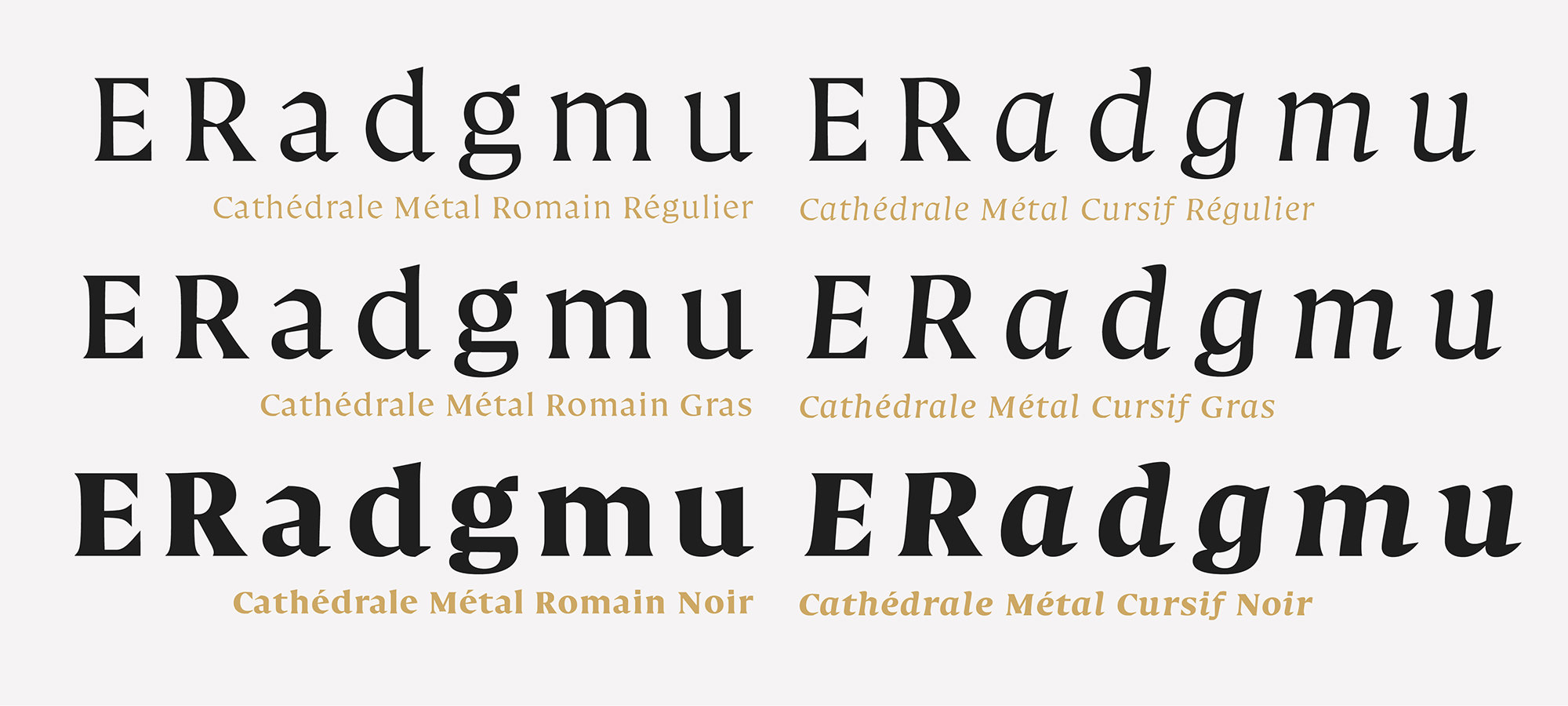
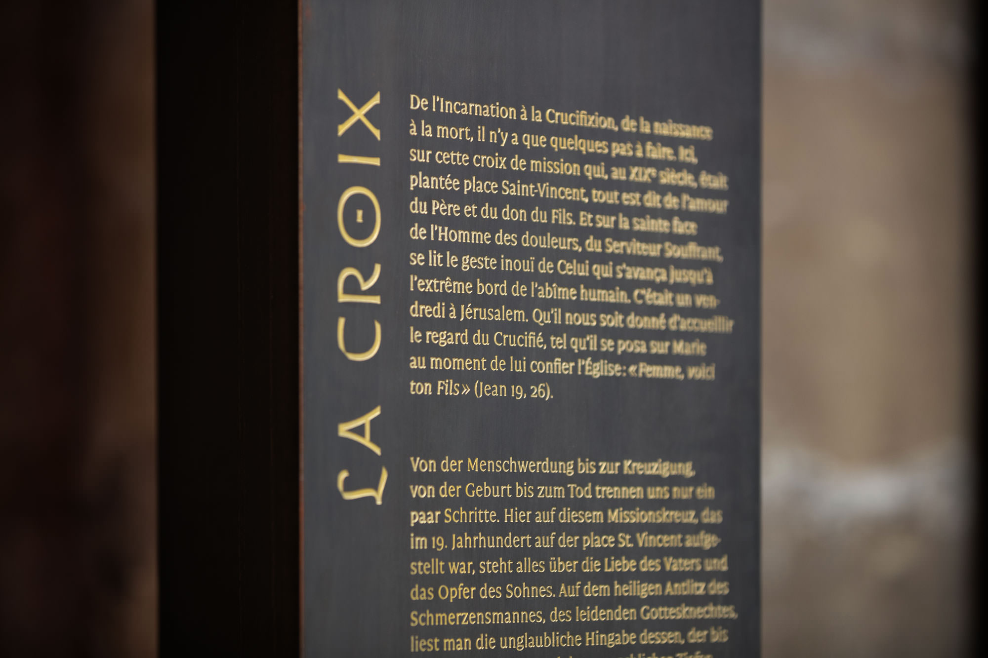
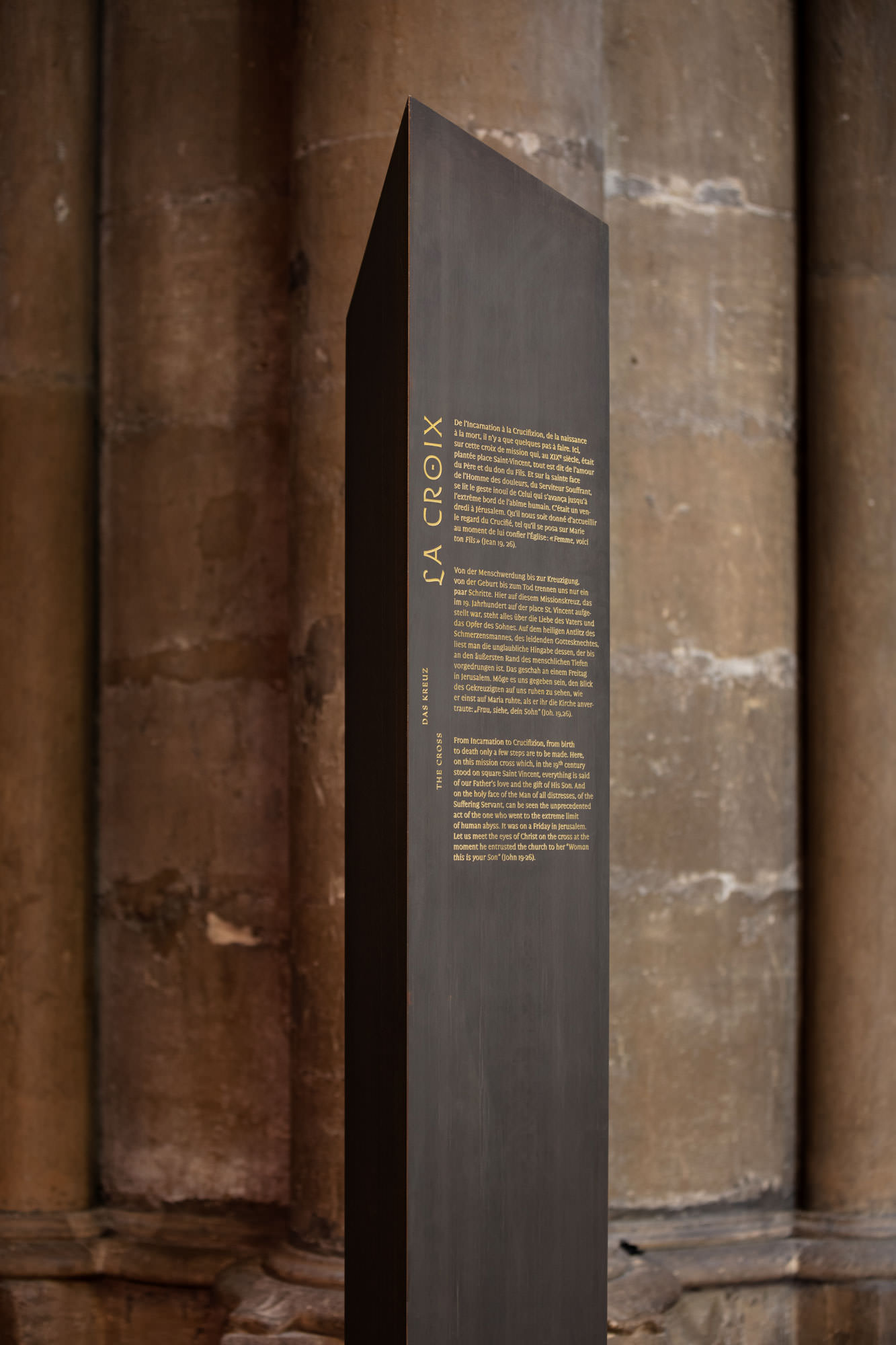
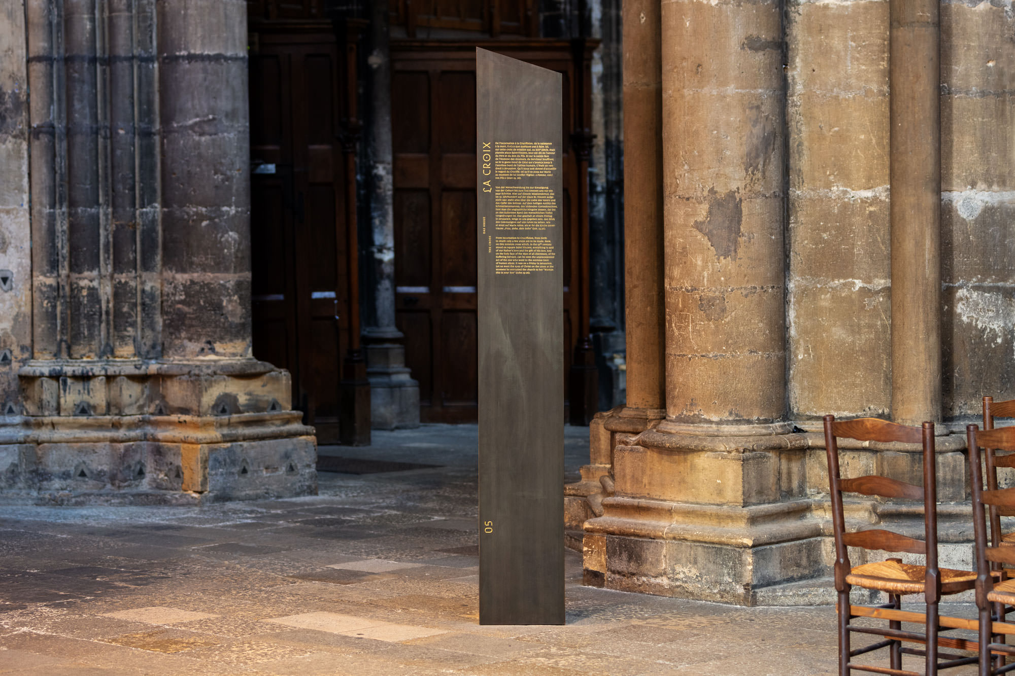
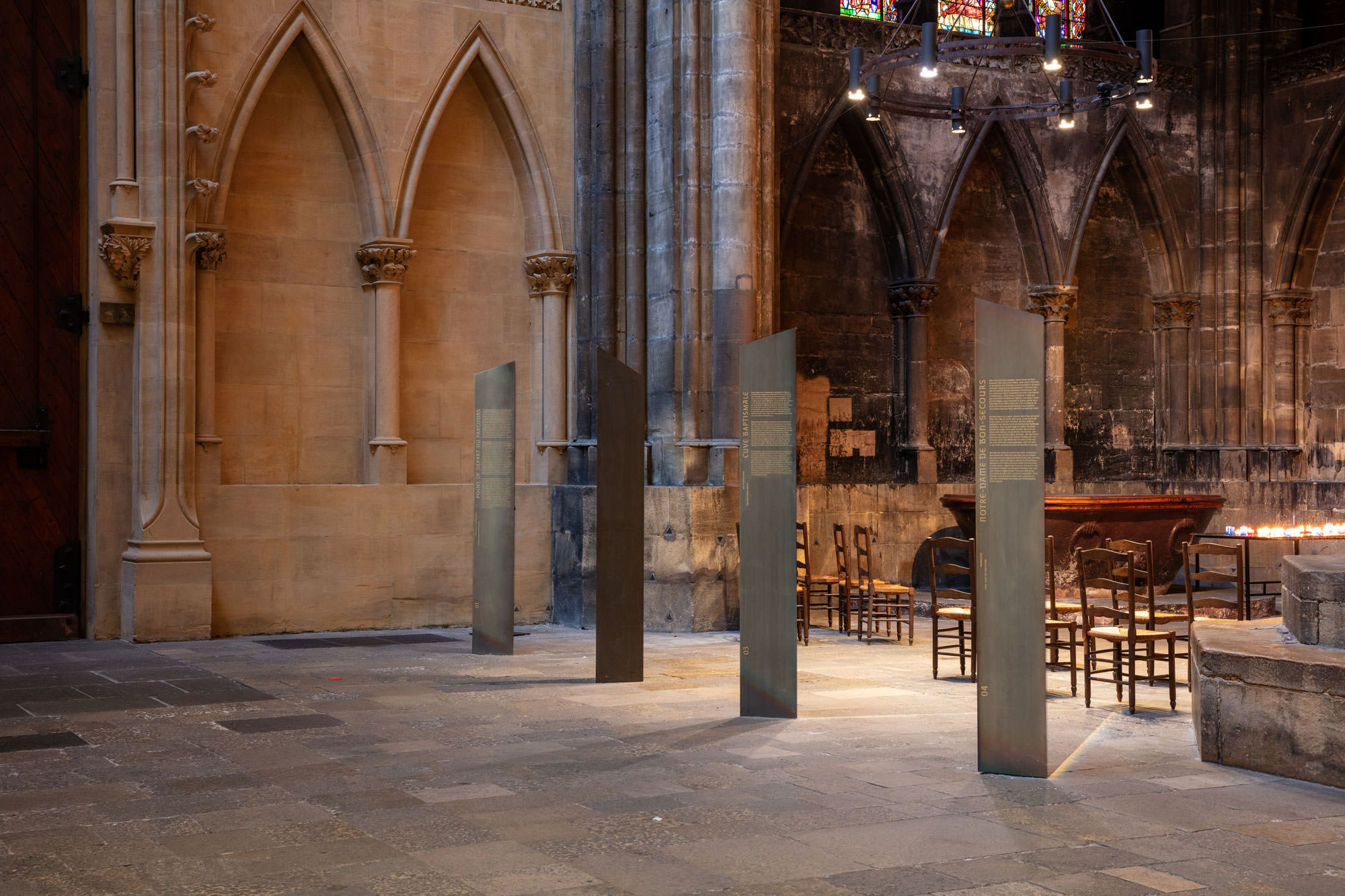
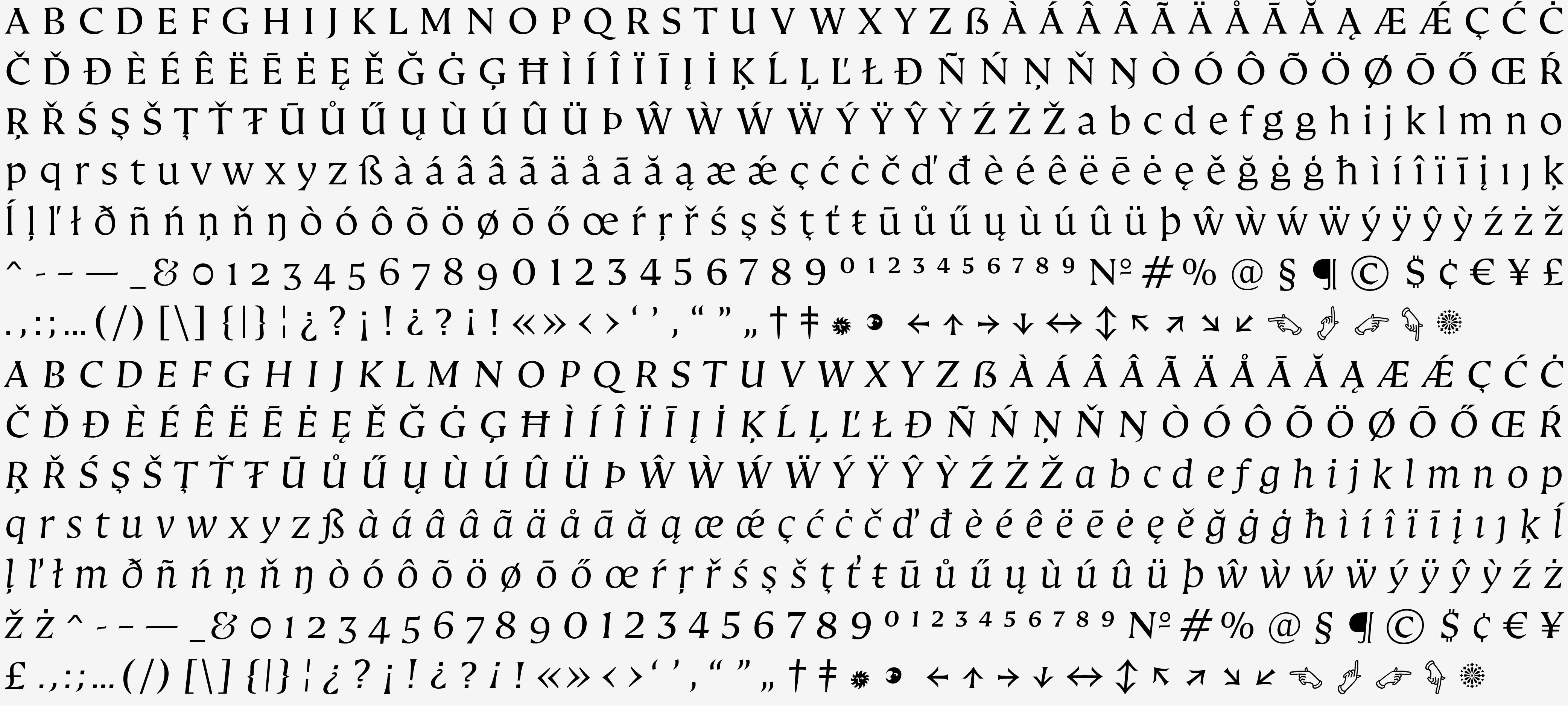
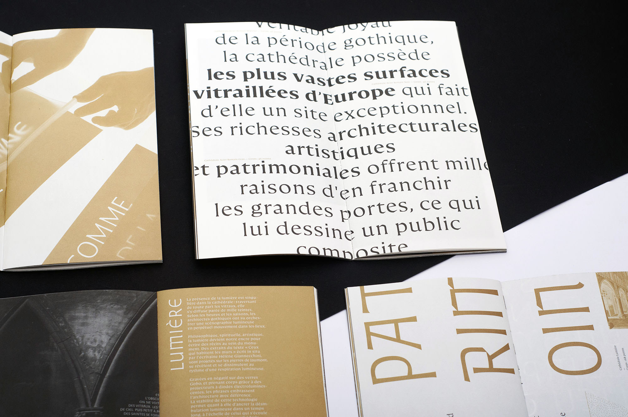
Secondly, we designed Cathédrale Métal conceived for the informative texts engraved on several steel panels installed throughout the building. This subfamily includes three weights (Régulier, Gras, Noire) in both Roman and cursive styles, and its anatomy discreetly evokes the density and texture of text in Gothic script: somewhat compact, slightly angular and with short ascenders and descenders that allow for reduced interlinear spacing.
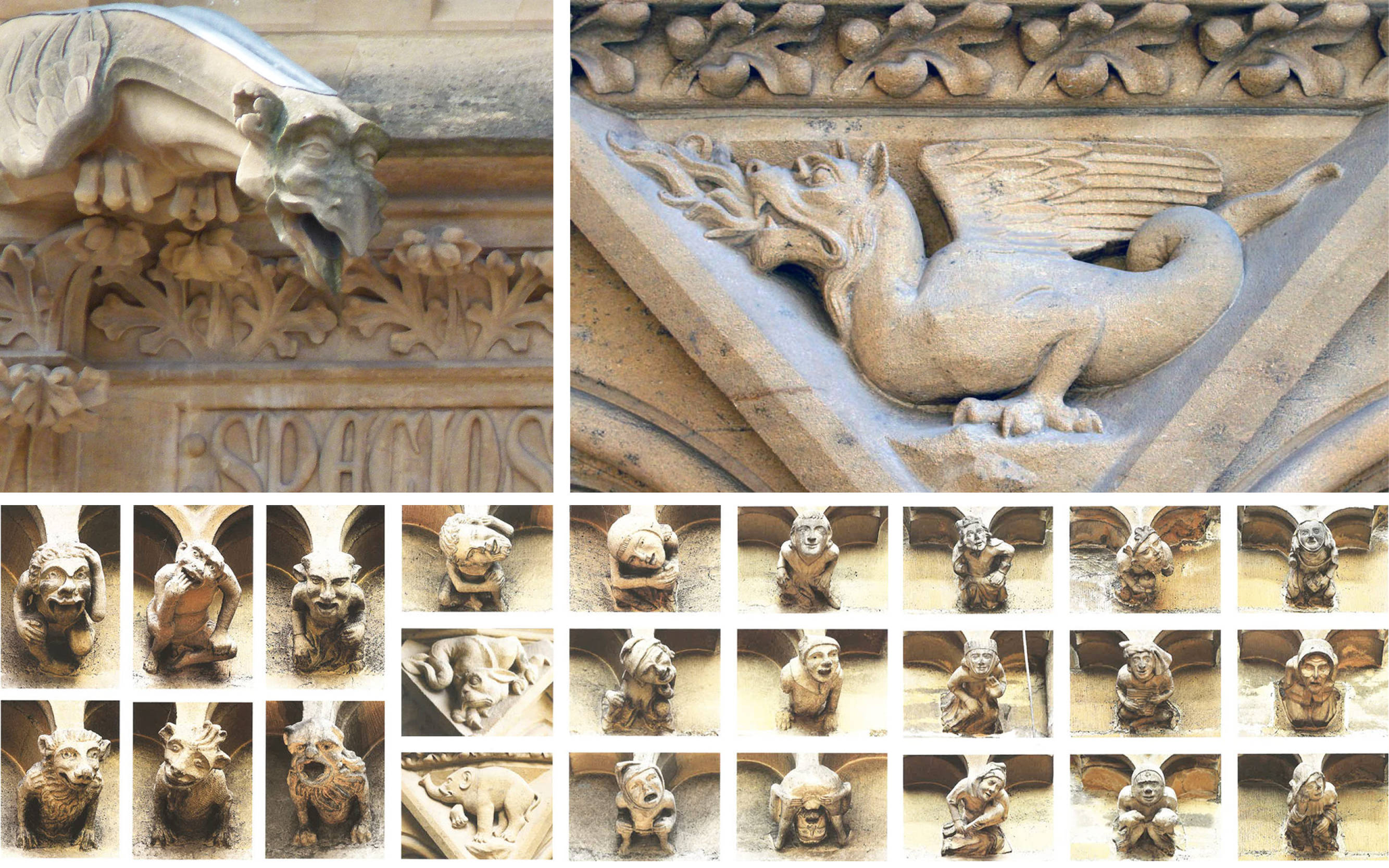
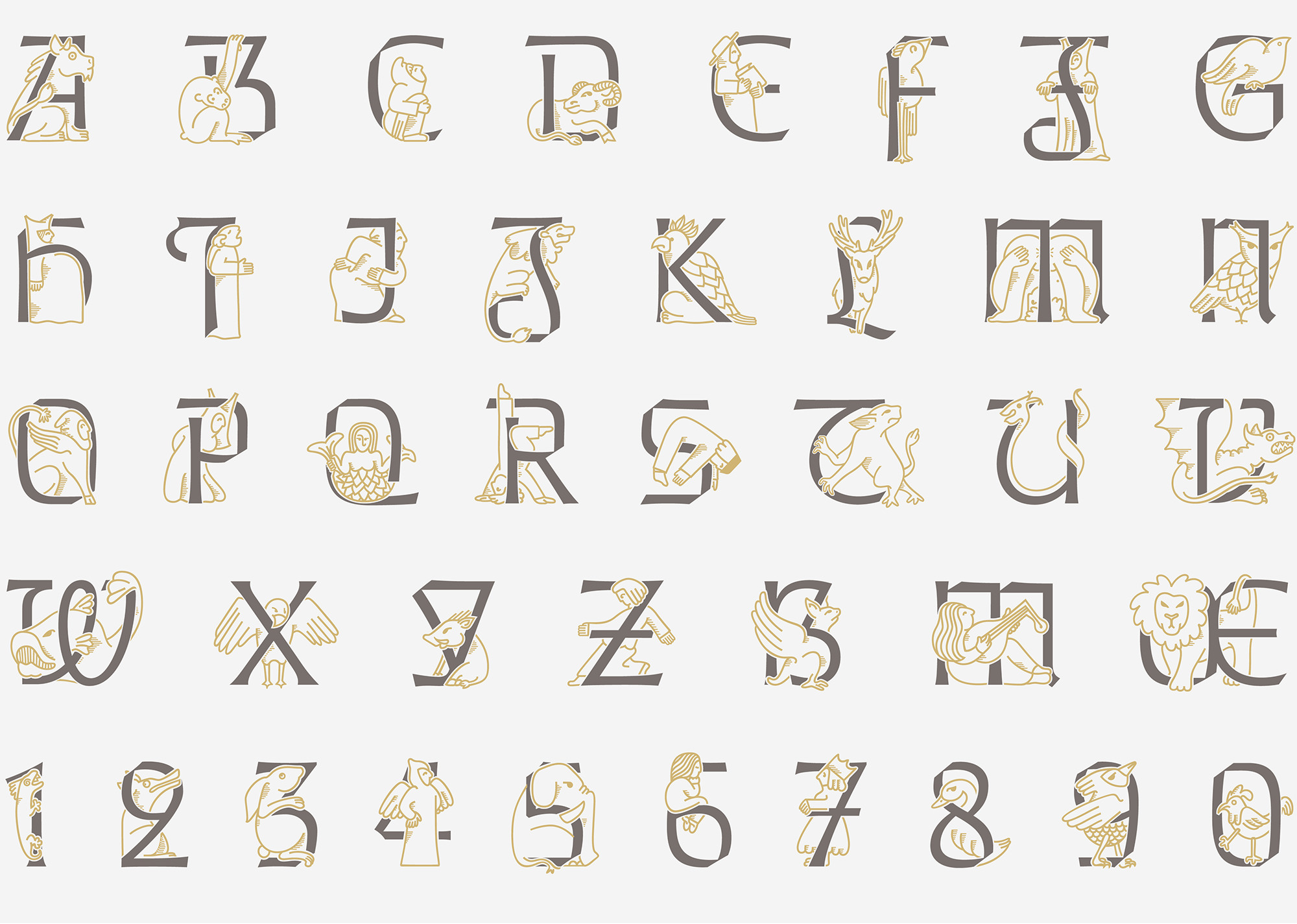
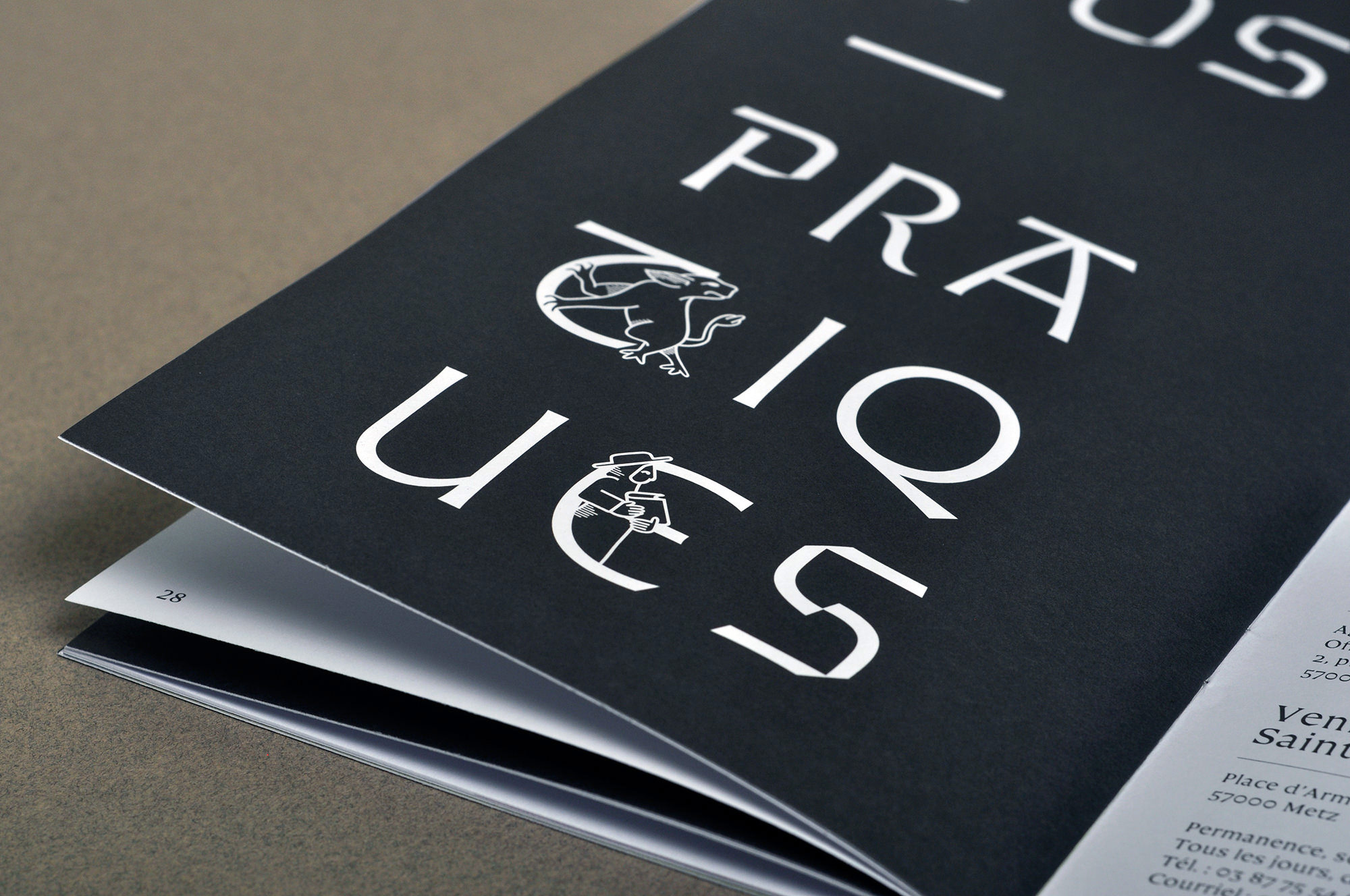
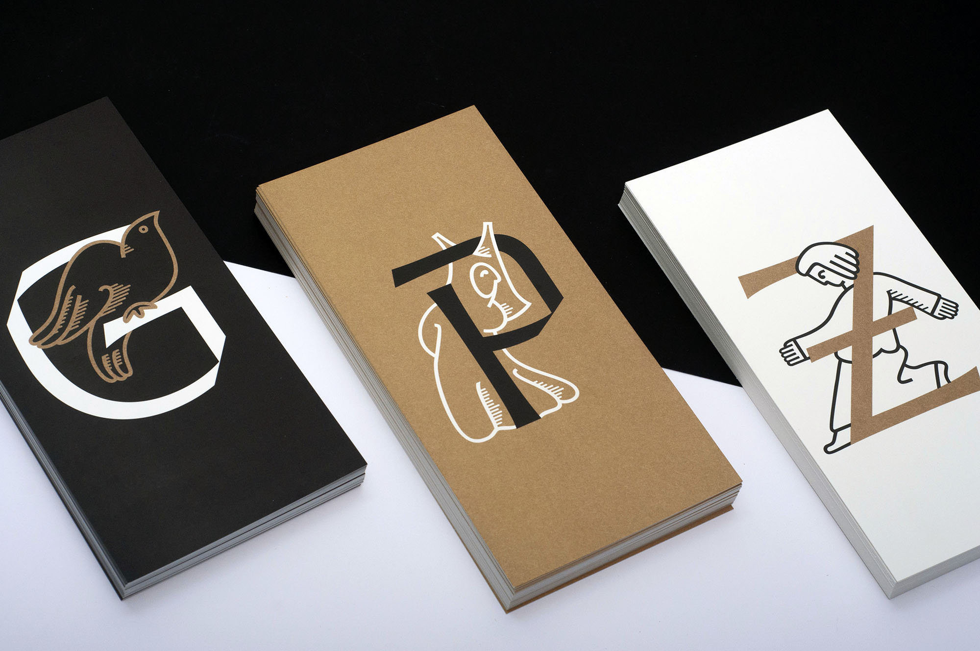
Finally, the theatrical medieval characters, monsters and chimeras that appear in the sculpted decoration throughout the building, inspired a third style: Cathédrale Enluminée, a set of carefully hand-drawn illuminated letters to be used as initials on publications and special occasions.
Read all about this project in the blog article written by Francis Ramel.